Welcome Art and Democracy lovers to the first round of the New Logo poll
After calling for entries to replace any logo on the wiki, we've recieved entries in the following categories:
- Wiki News Digest (2 Entries).
- Main Nukapedia Logo (16 Entries)
You'll find more information on how this is going to work below
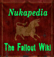
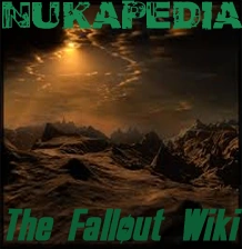
Wiki News Digest logo
As the number of entries is below the threshold to trigger the "Stage 1" vote, both entries will proceed immediately to stage 2, where you will be able to exercise a single vote for either of the two contestants, or vote to keep the existing logo.
Just in case the Main Nukapedia logo entry could influence your decision, we'll be holding this vote concurrently with the Stage 2 Nukapedia vote.
Main Nukapedia Logo Contest Rules
Voter Eligability
I remind all voters that as per the voting requirements for this change posted prior to this page being created (in the wiki news digest, and the first logo change page), all voters must meet the following criteria:
- You must be a registered Wikia/Nukapedia member
- You must have an edit somewhere on this wiki from before 20 Jan 2012.
Voters not meeting these guidelines are still welcome (and encouraged) to have your say. However your votes will not be counted.
The stages
As the number of entries has crossed the higher threshold set for the Stage 1 vote, it is intended that the top three contestants will proceed from Stage 1 into Stage 2. In the event of a tie, or near tie, this number may be increased; conversely if less than 3 entries appear to be viable, only those which are clearly viable will proceed. Those that proceed will be pitted against the existing logo in a single-vote round.
Your Vote Today
You may vote for, or against, as many entries as you like. Please vote "Yes" if you would be happy to see the entry as the main logo for Nukapedia; please vote "No" if you would not like to see this entry proceed to stage 2 at all, and vote "Neutral" if you'd like to make a comment or Flavour preference, but do not wish to be included in the vote count.
Determining winners
The counting method that will be used is "Net Yes" votes - that is Yes votes, less no votes - Maybes are excluded for counting purposes. Some examples on how this would work:
Entry 1 has 6 "Yes" and 5 "No" - Entry 1 has a "Net Yes" score of 1 (6-5)
Entry 2 has 6 "Yes" and 2 "No" - Entry 2 has a "Net Yes" score of 4 (6-2)
Entry 3 has 2 "Yes" and 14 "No" - Entry 3 has a "Net Yes" score of -12 (2-14)
"Viable" for the purposes who deciding to adjust the number of entries that proceed to the next stage is a term I'm deliberately leaving a little vauge in order to give a little wiggle room, but it basically means that common sense will be applied - For example if there are 2 entries with a Net Yes of half a dozen or so, and then half a dozen entries with a net yes of less than 0, then you can expect just the top 2 to proceed. Additionally, if an entry has a significantly lower number of voters then it may also be deemed not-viable - it depends on what else is going on.
Things to bear in mind while you're deciding
- Some entries have included page mock-ups, Favicons, and other additional material. Please note however there is no strict requirement for entries to have these for stage 1 - they become manditory only if they proceed to stage 2. Whilst when placing your vote it may be worthwhile to think about how the entry may be displayed on the page, please do not vote against an entry simply because this additioonal information was not included - we're more concerned about "Concept" rather than "Execution" at this stage - proceeding entrants will be given an opportunity to create or improve their entry for the next stage.
- Some entries have "Flavours" - different versions of the same basic concept. Where there are different flavours, you may indicate your preference for a flavour, some of the flavours, or against one or more flavours. You may also vote without preference. Even if you vote "No" or "Maybe" you can still express this preference if you prefer.
- You're going to be looking at this icon for a long time, and its going to become a very important part of the Wiki's identity, so make sure its something you like.
The Poll Dialog box with Close date
The Dialog box doesn't seem to be working properly - its giving the wrong close date. This vote closes on 3 Feb. Please use the following codes to state your opinion.
* {{YES}} ~~~~ (and any comment) to vote yes.
* {{No}}} ~~~~ (and any comment) to vote no.
* {{Neutral}}~~~~ (and any comment) to abstain.
Just for ease of counting, separate headers have been included for each vote type.
Image Subsitution
Just for the entrants... As this stage is about concept, not execution, you may substitute any image submitted so far for one that is of a better quality, cleaned up, depixelised, corrected etc. As long as the image is the same basic concept as that which it replaces, its okay.
Things like major colour changes, or complete new concepts are out.
You may also add images that show your concept in action.
If there are any questions, please drop me a line on the talk page - and preferably be avail around 0000-0200GMT to discuss it.
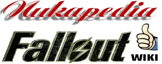
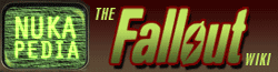
Nukapedia Logo Contestants
In no particular order
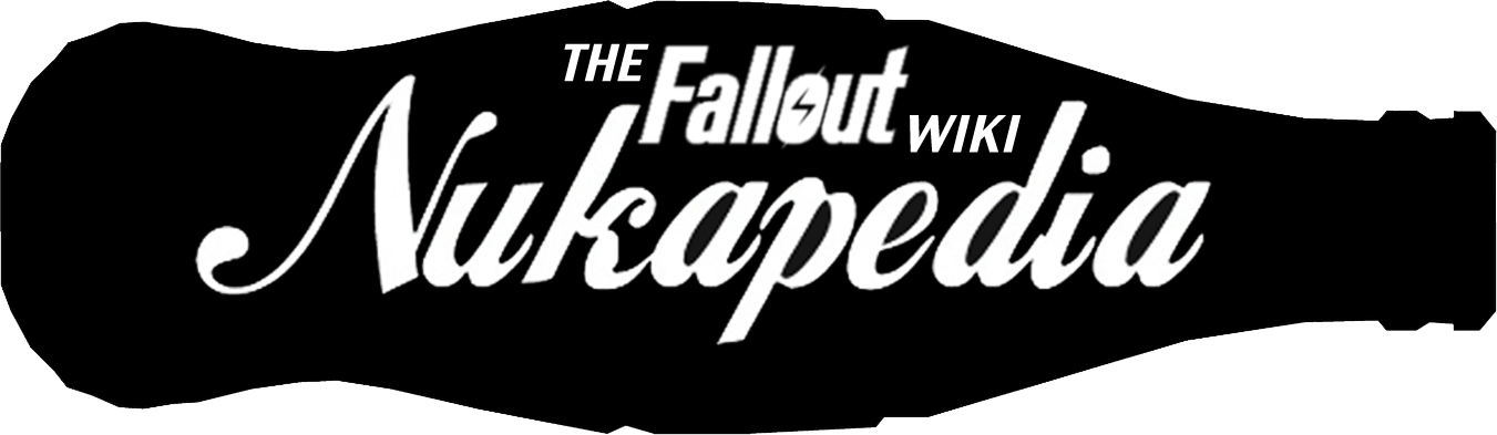
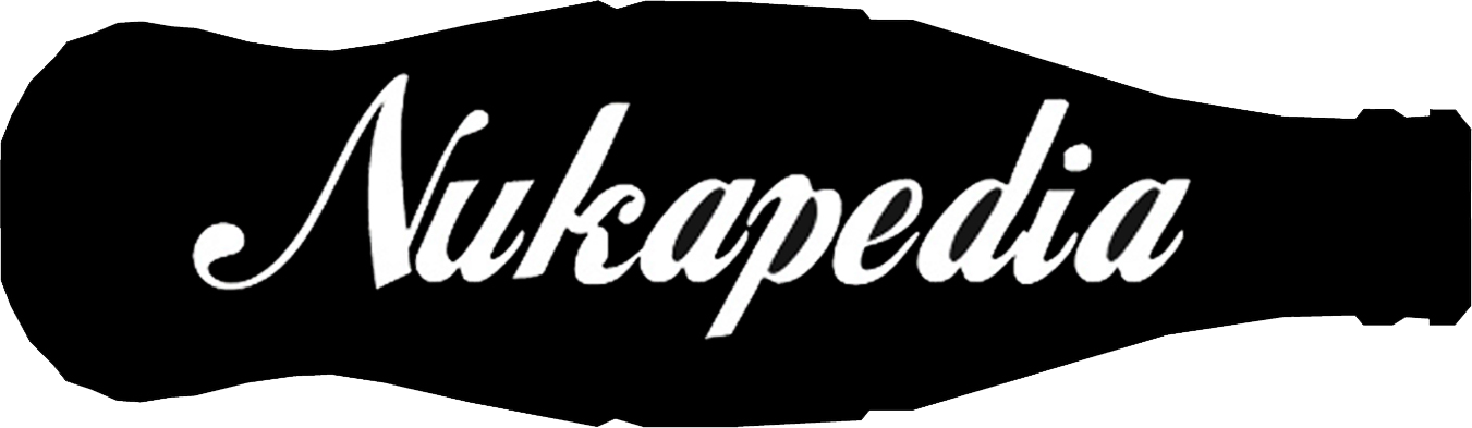
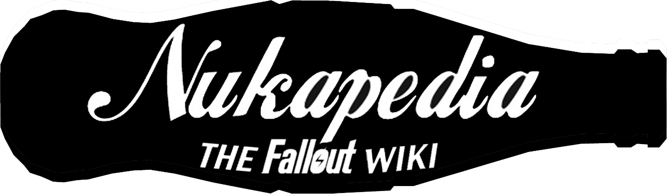
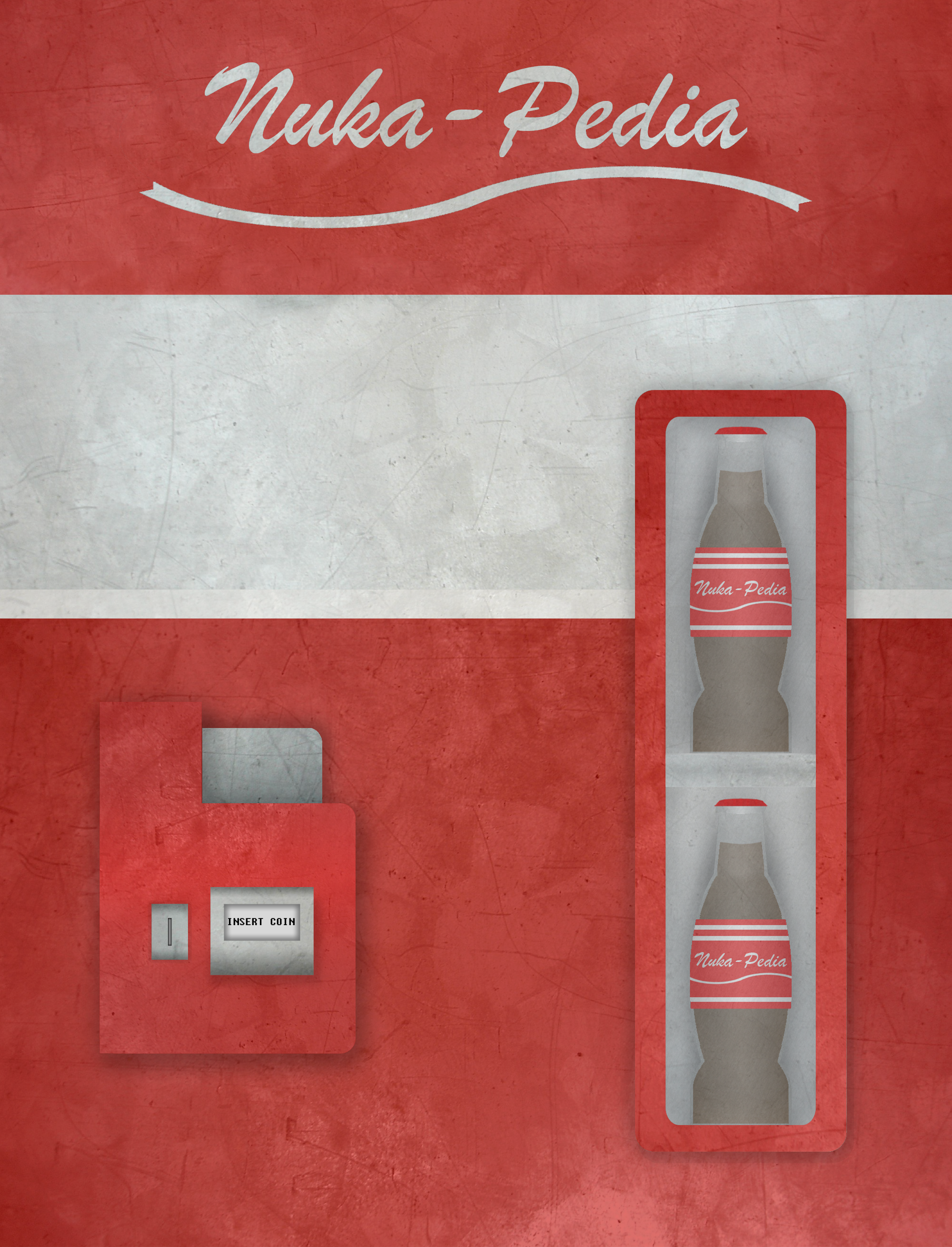
Nukapedia Bottle Logo - 114/Yes Man
Hi there everyone. I've made a few variations of the same site logo. I originally made a really rough image of what I thought it should look like long before the polls ever opened to the public, but since then I've improved my idea and this is what I came up with.
I know that many people are saying that "This is a Fallout site, not a soda site", but remember, the community named this Nukapedia. And the first thing that any Fallout fan thinks of when they hear Nuka is Nuka-Cola. So, to tie in the name with the logo, I decided to go for a simple silhouette of a cola bottle with the site name along it.
As you can see, the only differences between the three are the spacing and positioning of the site name. It's up to the community to decide which, if any, looks the best. When deciding, think about which is the easiest to read and what looks the best.
s a final addition, I've made two Favicons (the small images displayed with the URL) that can be used in general. Although I admit they're not great, the first is a Nuclear symbol, whereas the second is a (rather pixellated) Vault Boy giving the thumbs up. I made these up in a few minutes, so they're not very good. But I thought considering we need one and only two other submissions had been made, I'd give it a go.
(NOTE: Because of the format of the Favicon files, they do not appear on the page.)
And in the end, it doesn't matter to me if my designs make it through or not. I just want the whole community to be happy with the choice they made for the site, regardless of wether or not that includes my suggestion. Thanks.
![]()
![]()
![]()
Votes in Favour
 Agent c No Subtitle, or subtitle at the bottom.
- -ΣΔLet's talk! This one looks great, actually, especially for an anon :P
- BusinessMonkey Since I'm prone to like the current 'green theme', I like the 'neutrality' of the bottle, so it's a Yes from me.
- Charcoal121 Looks great. They all look great, but I'm in favor of the one at the top.
- Plooto 20:07, January 20, 2012 (UTC) I agree with business monkey, I like it.
- Mrs Chebanger 20:27, January 20, 2012 (UTC)
- Doc Incognito 22:11, January 20, 2012 (UTC) I'm a sucker for well-done silhouettes, and this is certainly a well-done silhouettes.
- TheFullShrimp 08:51, January 21, 2012 (UTC) I like it, especially the last one with the subtitle under.
- Xxfallout turkeyxx 14:45, January 21, 2012 (UTC) i like it with the subtitle on the bottom
- -- Paladin ACES 19:33, January 21, 2012 (UTC) i prefer the one with the subtitle at the top
- Stupidman 04:41, January 21, 2012
Votes against
- I'm more in favor of old but new the bottle cap has my vote. - DavidCG
- Sorry Yessie. Skål!
- I'm not a lover of it sorry. The Australian Kiwi 20:48, January 20, 2012 (UTC)
- --m.haines 23:08, January 20, 2012 (UTC) don'tlike it to large and to new looking
- Nothing against it, I like it personally. Its against what it will be in, look at the Fallout Wiki, look at the colour, even if we make the colour Dark Purple or Milky White, this logo is not going to fit in. --Mr. Youtube 02:44, January 21, 2012 (UTC)
- Eddo36 13:16, January 21, 2012 (UTC) too much soda reference for Fallout wiki. Fallout/nuka-cola is NOT coca-cola
- OutOfTimer Wanna chat? 20:37, January 21, 2012 (UTC) I'm sorry.
Excluded votes
Neutral/abstain and comments/questions
- Sirota554 I think it's good but it seems more coca cola than fallout too me.
- I like the idea, but there is just not enough color.--Hate Mail :D 01:09, January 21, 2012 (UTC)
- MysteryStranger: Trust in the power of Infinity! 09:48, January 21, 2012 (UTC)
- Carinth sorry it is more a cola site logo then a fallout logo. It's a good concept.
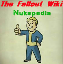
Nukapedia Wordmark - Carinth
Here are the submissions I would like to enter for the consideration as our new logo to be used on wiki. After working through several design ideas, I feel these 3 keep to the feel of our site and it's uniqueness also.


I also have taken the time to make examples for each as it would be displayed on the webpage, it seems to keep the feel of our original logo we now use but just gives it an added feel and isn't to distracting or hard on the eyes. With the colors seeming to sit well with one another.,

Votes in Favour
- Agent c No Thumb
- Not really my favorite. Also, not a fan of the thumb. --Hate Mail :D 01:10, January 21, 2012 (UTC)
Votes against
- Sirota554 sorry I don't feel the font works for fallout.
- For something I'll have to be looking at on every page for the duration of my time on the wiki, it's very boring. No offence. 114.77.77.5 04:31, January 20, 2012 (UTC)
- The Australian Kiwi 17:45, January 20, 2012 (UTC)
- Plooto 20:08, January 20, 2012 (UTC) Sorry, just don't like it.
- Mrs Chebanger 20:29, January 20, 2012 (UTC)
- I very much dislike the compostition as it seems too mish-mash to me. I also agree with Yes-Man. Its boring. DragonBorn96
- MysteryStranger: Trust in the power of Infinity! 09:56, January 21, 2012 (UTC)
- OutOfTimer Wanna chat? 20:37, January 21, 2012 (UTC) I'm sorry.
Excluded votes
-
173.61.161.188 02:20, January 21, 2012 (UTC) Bad font and looks more like a vault door than a bottlecapSee prior vote.
Neutral/abstain and comments/questions
- Carinth Easily fit on a billboard, t-shirt or other items, and keeps to the game. Try to imagine each design ingame and I see this as a moded logo on billboards for sure. The wiki mod plugin.
- -ΣΔLet's talk! I'm in the middle here
- Same here. Skål!
- BusinessMonkey I don't like the font of 'Nukapedia' it's not easy to read, otherwise it's a fine submission.
- Eddo36 13:21, January 21, 2012 (UTC) not bad, but can be better. I like bottlecap icon.
Carinth Requested alterations examples
I did make one with a border just so you know, I included it here it is. (I removed the shadow to make the Nukapedia more readible and had played with the idea of adding some bullet holes for that shot up sign look.) Since I had alot of mention on the nuka type I used I adjusted it to show an example with the text requested. I also added watermarks just to give it abit of color. The cap has been changed in these from the above logo's also.


Votes in Favour
- BusinessMonkey It's actually A LOT more relaxing and easier to watch without the shadows, but I'm still not fully convinced byt the type of font. Some of the others proposed are much more delightful to watch. I like the billboard idea a lot though!
- Hate Mail :D Not too bad. I don't like the thumb too much but overall, still a good logo for this wiki. Good job.
- A wise man once said - No Thumb. --Mr. Youtube 02:46, January 21, 2012 (UTC)
- Xxfallout turkeyxx 14:48, January 21, 2012 (UTC) i like to bottle cap one, but a a subtitle in there that says "fallout wiki"
Votes against
- The billboard part doesen't look good, but I don't really care as long the cap makes it into the logo. - DavidCG
- MysteryStranger: Trust in the power of Infinity! 09:52, January 21, 2012 (UTC)
- billboards (containing post-Great War ads) shouldn't really exist in a post-apocolypse place. billboard should look more run-down, and I like bottlecap logo. Eddo36 13:17, January 21, 2012 (UTC)
- OutOfTimer Wanna chat? 20:37, January 21, 2012 (UTC) I'm sorry.
- My vote is still. For pieces of graphical design, too much is going on at once, there is no contrast between the "Fallout" text on the Billboard piece with the rest of the images on it. Overall, poor contrast and poor composition. Also, do you need to keep posting so many variations? Seems awfully desperate. DragonBorn96
Neutral/abstain and comments/questions
- User:Carinth I like it with the billboard, Fallout is made up of billboard ads all over and it gives it that real feel without moving to far from the original design logo we now use.
- I like the idea of a billboard. But it needs to be more post-apocolpyptic. Maybe a bit retro to fit with the Fallout style. 114.77.77.5
- 173.61.161.188 02:23, January 21, 2012 (UTC) Not sure how I feel, like the billboard but it seems too big and not very fallout like.
Because it can be bulky here are a few with the alterations but without the billboard, it can be matched to the present logo size that we now use for a seamless replacement. The only way I could think of to actually get the true fallout feel on the billboard would be to mod the unbordered text on a mod for ingame then take a screenshot simular to this http://ponibooru.413chan.net/post/view/30073?search=billboard but unfortunately I cannot make the mod to show it.


Here are the altered caps I think this is kinda what you meant with the extra text.


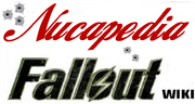
Terminal Entry - MetalFrenchToast
Well, here it is, my design for the main logo:
Favicon ![]()
Agent C's note: sorry, can't seem to get the sample to work, but you can view it here
Votes in Favour
- Plooto 20:09, January 20, 2012 (UTC) I like it, but I can see how it wouldn't belong because it doesn't match the background.
- Sirota554 Im gonna agree with Metalfrenchtoast. Killer Job man.
Excluded votes
![]()
![]() 20:14, January 20, 2012 (UTC) I'll just pat myself on the back for actually drawing this, without photoshop. Hurray for not using prerendered textures and gradient scales!
20:14, January 20, 2012 (UTC) I'll just pat myself on the back for actually drawing this, without photoshop. Hurray for not using prerendered textures and gradient scales!
Votes against
- Sorry Ci... Something about this one just doesn't sit right with me. Skål!
- CarinthSorry the colors just would be a little to harsh after a while.
- BusinessMonkey The colours are too strong, and it's a very daunting theme, which sadly isn't thought that well through.
- Mrs Chebanger 20:30, January 20, 2012 (UTC)
- Hate Mail :D Ehhh... It doesn't seem like Fallout really. Maybe Fallout 1 if anything. You did a good job though man.
- MysteryStranger: Trust in the power of Infinity! 09:50, January 21, 2012 (UTC)
- Eddo36 13:20, January 21, 2012 (UTC) yuck
- OutOfTimer Wanna chat? 20:18, January 21, 2012 (UTC) I'm sorry.
Excluded Votes
Neutral/abstain and comments/questions
- -ΣΔLet's talk!
- I don't dislike it, but I'm not sure if it's very Fallout-y. 114.77.77.5 04:32, January 20, 2012 (UTC)
- CarinthSorry the colors just would be a little to harsh after a while. I do like the design, with tweaks it has possibilities. Maybe try increasing the type size in the box and tone down the colors.
Excluded votes
* Anons are welcome to share their opinions and encouraged to do so, however, one must have registered and have at least one edit prior to January 20th.
![]() 173.61.161.188 02:24, January 21, 2012 (UTC) Like it better than the others but not a fan of the yellow.
173.61.161.188 02:24, January 21, 2012 (UTC) Like it better than the others but not a fan of the yellow.
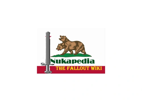
NCR Flag Logo - Mr YouTube
Votes in Favour
Votes against
- Too faction oriented, the new Wiki needs Fallout as a whole. - DavidCG
- Too many elements... Agent c
- -ΣΔLet's talk! Don't quite like it, I'm afraid
- At the risk of sounding rude, I still think this is shoddy work. Skål!
- Sirota554 don't think it works and its not the highest quality.
- 114.77.77.5 04:33, January 20, 2012 (UTC)
- BusinessMonkey I'm very much against the sword. Why a sword?
- The Australian Kiwi 17:37, January 20, 2012 (UTC)
- Mrs Chebanger 20:31, January 20, 2012 (UTC)
- I don't think the Sword really works at all with Fallout, and the NCR isn't the most important factor of the series, so there's not much reason to put it as the entire site's logo.--Divine Paladin 22:53, January 20, 2012 (UTC)
- Hate Mail :D Reminds me of something like Zelda. It's a no go for me.
- MysteryStranger: Trust in the power of Infinity! 09:34, January 21, 2012 (UTC)
- Eddo36 13:23, January 21, 2012 (UTC) as somebody said above, too faction oriented
- Xxfallout turkeyxx 14:53, January 21, 2012 (UTC) this wiki isnt just about NCR its about Fallout as a whole, and why the sword?
- OutOfTimer Wanna chat? 20:04, January 21, 2012 (UTC) I'm sorry.
Excluded Votes
Neutral/abstain and comments/questions
![]() User:Carinth It has potential but would need a rework to produce some viable designs. I like it but to rough at this stage, going in the right direction though.--Carinth 17:35, January 20, 2012 (UTC)
User:Carinth It has potential but would need a rework to produce some viable designs. I like it but to rough at this stage, going in the right direction though.--Carinth 17:35, January 20, 2012 (UTC)
Caesar's emblem - Mr YouTube
Votes in Favour
Votes against
- Again too faction oriented. - DavidCG
- Only linked to a single game Agent c
- -ΣΔLet's talk! ^
- I agree with Ci on this one. Skål!
- Lime green on dark red? Sorry, but no. 114.77.77.5 04:34, January 20, 2012 (UTC)
- BusinessMonkey Not relevant for the site. And bad colourscheme.
- The Australian Kiwi 17:37, January 20, 2012 (UTC)
- Mrs Chebanger 20:32, January 20, 2012 (UTC)
- It doesn't fit in any way. The green on red just looks ugly, pardon the rudeness. Caesar's Legion isn't important enough in the series yet to deserve its own logo, either.
- Hate Mail :D I agree with C. Too "one-directed"".
- MysteryStranger: Trust in the power of Infinity! 09:33, January 21, 2012 (UTC)
- Eddo36 13:24, January 21, 2012 (UTC) faction oriented
- Xxfallout turkeyxx 14:55, January 21, 2012 (UTC) reds a bad color and like everyone else said too faction oriented
- OutOfTimer Wanna chat? 20:04, January 21, 2012 (UTC) I'm sorry.
Excluded Votes
Neutral/abstain and comments/questions
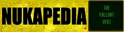
Wasteland Logo - Mr YouTube
Votes in Favour
- BusinessMonkey I like it, as an 'old school' theme, but it needs to be executed VERY well if it passes.
- This is a good one.--Ryker6121:40, January 20, 2012 (UTC)~1:38pm 1/20/2012
- Gets me emotional about Sudan for some reason. --Toa Schmeater-Akk 22:02, January 20, 2012 (UTC)
- I definitely like this one. Very nice, and Fallout-y. However, the font color doesn't match right, and it'd have to be fixed slightly to work well. --Divine Paladin 22:57, January 20, 2012 (UTC)
- Hate Mail :D Has a lot of potential. I would really like to see this one pass, but just like Business Monkey said, needs to be put in the layout just right. The font color doesn't match that well too. I still like it a lot.
Excluded Votes
* As previously stated.
![]() 173.61.161.188 02:29, January 21, 2012 (UTC) Like it but might need a slight color change and can barely see the lightning bolt in the logo.
173.61.161.188 02:29, January 21, 2012 (UTC) Like it but might need a slight color change and can barely see the lightning bolt in the logo.
Votes against
- It has no character not to sound cruel but it doesn't seem to fit very well. -DavidCG
- -ΣΔLet's talk! Just a little too much for me
- 114.77.77.5 04:35, January 20, 2012 (UTC)
- The Australian Kiwi 17:37, January 20, 2012 (UTC)
- TheFullShrimp 09:12, January 21, 2012 (UTC) I don't like it, I don't think it would look good as our site logo.
- Eddo36 13:20, January 21, 2012 (UTC) pretty picture, however not everywhere in Fallout is desolate as this picture implies.
- OutOfTimer Wanna chat? 20:16, January 21, 2012 (UTC) I'm sorry.
Neutral/abstain and comments/questions
- Skål!
- Mrs Chebanger 20:33, January 20, 2012 (UTC)
- MysteryStranger: Trust in the power of Infinity! 09:51, January 21, 2012 (UTC)
- Xxfallout turkeyxx 14:57, January 21, 2012 (UTC) i like the direction its going but it needs work
- Doc Incognito 22:59, January 20, 2012 (UTC) Sorry Mr. YouTube, the only part of it that says "Fallout" to me is the Fallout logo.
Requests
Some of you are saying that it has a lot of potential, the font needs to be changed, the colour needs to be changed. Put in your requests as to how I should change it here and I will. --Mr. Youtube 02:23, January 21, 2012 (UTC)
- If you're doing a colour change, please contact me first before linking the improved image. Agent c 02:51, January 21, 2012 (UTC)
Vault Boy - Mr YouTube
Votes in Favour
Votes against
- Agent c
- -ΣΔLet's talk!
- Skål!
- At risk of sounding rude, this is amateur work. 114.77.77.5 04:36, January 20, 2012 (UTC)
- BusinessMonkey Poor colour choice. It's not in harmony in any way.
- The Australian Kiwi 17:38, January 20, 2012 (UTC)
- Mrs Chebanger 20:34, January 20, 2012 (UTC)
- Hate Mail :D Doesn't sparkle or anything.
- MysteryStranger: Trust in the power of Infinity! 09:35, January 21, 2012 (UTC)
- Eddo36 13:26, January 21, 2012 (UTC) too half-assed
- OutOfTimer Wanna chat? 20:14, January 21, 2012 (UTC) I'm sorry.
Excluded Votes
Neutral/abstain and comments/questions
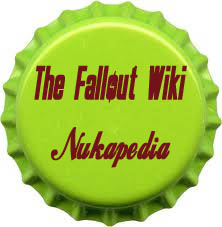
Mr YouTube's Bottlecap - Mr YouTube
Votes in Favour
- -ΣΔLet's talk! I like the colour on this one, a lot.
Votes against
- I've said it before, I can't comprehend dark red and lime green together. 114.77.77.5 04:37, January 20, 2012 (UTC)
- BusinessMonkey Same as above poster
- The Australian Kiwi 17:38, January 20, 2012 (UTC)
- Mrs Chebanger 20:35, January 20, 2012 (UTC)
- --Divine Paladin 22:59, January 20, 2012 (UTC)
- Hate Mail :D
- I don't think I saw a green bottle cap (maybe on alcohol, but still not on fizzy drinks). MysteryStranger: Trust in the power of Infinity! 09:37, January 21, 2012 (UTC)
- Eddo36 13:28, January 21, 2012 (UTC) doesn't look like a realistic bottlecap
- Xxfallout turkeyxx 14:59, January 21, 2012 (UTC) im sorry, but LIME green? on a bottlecap?
- OutOfTimer Wanna chat? 20:13, January 21, 2012 (UTC) I'm sorry.
Excluded Votes
* As previously stated
![]() 173.61.161.188 02:33, January 21, 2012 (UTC) I agree, the colors are bad.
173.61.161.188 02:33, January 21, 2012 (UTC) I agree, the colors are bad.
Neutral/abstain and comments/questions
- Doc Incognito 23:00, January 20, 2012 (UTC) I second 114's comment.
Jonny Mr Ninja's Bottlecap - Jonny Mr Ninja's
![]()
Votes in Favour
- -ΣΔLet's talk!
- BusinessMonkey It's funny and nice. Cartoony can be good. But the colours are WAY too bright.
- Xxfallout turkeyxx 15:01, January 21, 2012 (UTC) i approve
Votes against
- The perspective is odd. That, and it's a bit small. 114.77.77.5 04:39, January 20, 2012 (UTC)
- Too small. - DavidCG
- OutOfTimer Wanna chat? 20:03, January 21, 2012 (UTC) I'm sorry.
Neutral/abstain and comments/questions
- Maybe as a favicon for another entry Agent c
- Mrs Chebanger 20:36, January 20, 2012 (UTC)
- Hate Mail :D Agree with C.
- Its at an odd angle.
- Would be better when "The Fallout Wiki" was written. MysteryStranger: Trust in the power of Infinity! 20:39, January 21, 2012 (UTC)
- Eddo36 13:29, January 21, 2012 (UTC) can be made to look more realistic and less cartoony
- Sirota554 It's too clean. The dash next to nuka is superfluous and oddly placed.
Mushroom Cloud - Carter 190s
Votes in Favour
Votes against
- Too many elementsAgent c
- Apocalyptic is spelt wrong :P 114.77.77.5
- -ΣΔLet's talk!
- BusinessMonkey Too unpolished.
- Mrs Chebanger 20:37, January 20, 2012 (UTC)
- Hate Mail :D Texture is all wrong.
- Too large for a logo.
- Eddo36 13:29, January 21, 2012 (UTC) too cliche
- Xxfallout turkeyxx 15:03, January 21, 2012 (UTC)
- OutOfTimer Wanna chat? 20:03, January 21, 2012 (UTC) I'm sorry.
Neutral/abstain and comments/questions
Nukapedia Rust Red - Person of Refinement
Votes in Favour
- I like it Agent c
- -ΣΔLet's talk!
- Skål!
- Sirota554
- BusinessMonkey In the case that we won't remove the 'green theme', I'm very much for this being the main logo. Could be polished some more though.
- The Australian Kiwi 20:52, January 20, 2012 (UTC)
- Love it. Chief Talk to me!
- Plooto 20:11, January 20, 2012 (UTC) I really like this.
- Mrs Chebanger 20:39, January 20, 2012 (UTC)
- I definitely like this one. Very well made, but could be polished a bit more. --Divine Paladin 23:02, January 20, 2012 (UTC)
- Reminds me of the old Fallout games. Though I'm not really a fan of the classics, I just can't deny that this logo looks sick! --Hate Mail :D 01:03, January 21, 2012 (UTC)
- TheFullShrimp 08:52, January 21, 2012 (UTC) I like this one also, looks Nuka-Cola-ish and has the whole Pre-War feel too.
- MysteryStranger: Trust in the power of Infinity! 09:57, January 21, 2012 (UTC)
- Eddo36 13:35, January 21, 2012 (UTC) improvised/run-down sign fits with Fallout setting. maybe wording should be little rusted in some areas, and not over the holes in the background to simulate a sign with holes.
- -- Paladin ACES 19:40, January 21, 2012 (UTC) i think that it needs a border though. im not sure how it would look just like that with a perfect rectangle. maybe like a bill board or something?
Excluded Votes:
-
173.61.161.188 02:35, January 21, 2012 (UTC) Love it.As previously stated.
Votes against
- Carinth It's ok but not really what I see for a wiki.
- I agree with Carinth
- OutOfTimer Wanna chat? 20:02, January 21, 2012 (UTC) I'm sorry.
Excluded Votes
*
![]() While I do see it as something suit for a wiki, what is Fallout about this other than the words? --184.65.67.127 04:23, January 21, 2012 (UTC)
While I do see it as something suit for a wiki, what is Fallout about this other than the words? --184.65.67.127 04:23, January 21, 2012 (UTC)
Neutral/abstain and comments/questions
- Not sure. It's just rust with text over it. Not to say it's bad, it's just not very creative. 114.77.77.5 04:41, January 20, 2012 (UTC)
- Doc Incognito 23:01, January 20, 2012 (UTC) It's a good idea, but I think the execution could be better; for this conflict, I abstain.
- Xxfallout turkeyxx 15:04, January 21, 2012 (UTC) it has potential
Sirota's Bottlecap logos - Sirotta 554
Im including various flavours of the same basic design, there are a few variations and they are all interchangable.
Main Bottlecap Variants
![]()
![]()
Possible Logo Background Variants


And Here In Red

Page Views
![]()
![]()
 This one has a test of the background, I feel a tiled image works best and I think cracked desert earth works for the setting.
Votes in Favour
- I like the bottle cap logos in general, and this looks very polished. Agent c
- Y'all are looking at magnificent artwork here! -ΣΔLet's talk!
- Professional stuff here. 114.77.77.5
- BusinessMonkey I very much like the font and bottlecap, but I don't like the colours at all. Either make the brown, red with partial rust, or make the limegreen some other, more fitting colour for this site. The limegreen is just too dangerous.
- OutOfTimer Wanna chat? 16:07, January 20, 2012 (UTC) The design itself is superb but the fact that a bottlecap Nuka-cola logo is green makes it all a joke. I know it's not your fault, though.
- The one with the white background will be best in my opinion. The Australian Kiwi 17:40, January 20, 2012 (UTC)
- I like this one.
- Plooto 20:12, January 20, 2012 (UTC) Can't decide between this and the bullet holes one, I think I prefer this.
- Mrs Chebanger 20:40, January 20, 2012 (UTC)
- I love most of these, but the coloring is odd on some of them. Too many people used the bright green during the competition.--Divine Paladin 23:04, January 20, 2012 (UTC)
- I like the logos here. I just don't think that most of the combinations work. Still, I'm gonna vote yes. --Hate Mail :D 01:06, January 21, 2012 (UTC)
- Balger I feel this bottlecap fits. 11:56 January 21 2012 (UTC)
- Eddo36 13:43, January 21, 2012 (UTC) I like it
- Xxfallout turkeyxx 15:09, January 21, 2012 (UTC) these are really good
- -- Paladin ACES 19:42, January 21, 2012 (UTC) i prefer the red bottle cap variants
Excluded Votes
Votes against
- Skål!
- Carinth Although I like it I see it more suited for a mod or game site, something where you need a flashy little eyecatcher, but otherwise the feel for the wiki isn't there.
- --m.haines 23:12, January 20, 2012 (UTC) looks way to much like teenage mutant ninja turtles to me for some raisin
Excluded Votes
* Whilst anon opinions are welcomed, voters must be registered and have an edit prior to 20 Jan.
![]() The bottlecap is good, the combinations isn't. --184.65.67.127 04:24, January 21, 2012 (UTC)
The bottlecap is good, the combinations isn't. --184.65.67.127 04:24, January 21, 2012 (UTC)
Neutral/abstain and comments/questions
- Sirota554 I feel that this logo really works for the energy of this site, it's not all about cola it's more about fallout and that world and especially the green I really like the idea of radiation, vats of goo theme on top of a bottle cap. This radiated, rusted piece of the old world they cling too for currency. Again though all options are interchangable, the colors can be altered but I think it really works personally.
- Hm? Oh! I'm KnowledgeProspector. 02:02, January 21, 2012 (UTC) You've got the right idea for the logos! It's got a clean bottle cap that speaks about Nuka Cola... or Nukapedia for that matter. I feel a bit weird with the new background, though, since they're too orange. Maybe use a ruined city of some sort. Or..... a landscape view of the wasteland. Iunno. It just feels weird to me. Just my opinion.
- Doc Incognito 22:23, January 20, 2012 (UTC) The bottle cap is top-notch; in fact, I can hardly believe it was Photoshopped. However, I couldn't live with the possibility of a brown-and-lime-green color scheme.
Sirota's Screen logo - Sirotta 554
Screen Logo

Votes in Favour
- Agent c 02:54, January 21, 2012 (UTC) Maybe with a font change for Nukapedia, and getting rid of the static lines.
- Xxfallout turkeyxx 15:05, January 21, 2012 (UTC) i like it!
- Bldudas 19:11, January 21, 2012 (UTC) I really like it.
Votes against
![]() User:Carinth Again I like it, but it just conveys that we are a fallout based site but no conveyance of information accumulation which is what a wiki is.
User:Carinth Again I like it, but it just conveys that we are a fallout based site but no conveyance of information accumulation which is what a wiki is.
- MysteryStranger: Trust in the power of Infinity! 09:59, January 21, 2012 (UTC)
- OutOfTimer Wanna chat? 20:02, January 21, 2012 (UTC) I'm sorry.
Neutral/abstain and comments/questions
- I like that it moves, but it might be distracting. 114.77.77.5 04:38, January 20, 2012 (UTC)
- BusinessMonkey Again, I like the idea of more 'old school' logos, but again, the colours are too glammy.
- Mrs Chebanger 20:41, January 20, 2012 (UTC)
- Green on Red for the Fallout Wiki doesn't work too well. --Divine Paladin 23:05, January 20, 2012 (UTC)
- Sirota554 I feel that this logo with the old crt and the static nuka pedia works. Its simplistic I don't think the motion would be distracting though that is my concern as well. My other concern is the background and " THE FALLOUT WIKI" but if this one got chosen those are changeable easily.
- Hate Mail :D Too many flaws, but good effort and style. I also have a feeling that it could make the main page lag on a bad day.
- It wouldn't make it lag at all the image is about 20kb. Much less than some static images. --Sirota554 14:24, January 21, 2012 (UTC)
- 173.61.161.188 02:45, January 21, 2012 (UTC) Not the best, but not the worst.
- The animation makes me a little... I don't like that. Other than that, it's good. -ΣΔLet's talk! 22:05, January 21, 2012 (UTC)
Doc Incognito's Cap entry - Doctor Icognito
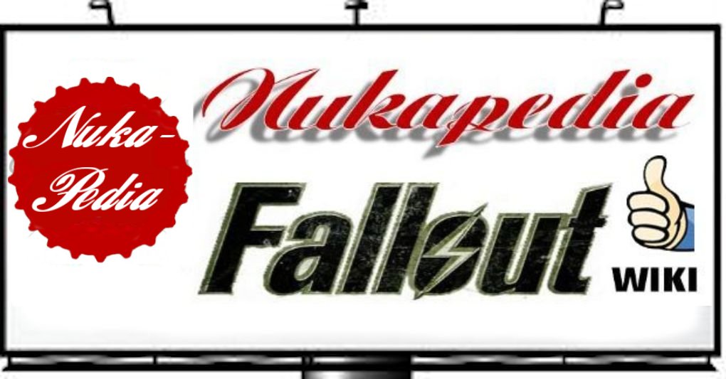
Hey everyone, Doc Incognito here with all of the final versions of the art I created for NukaPedia. We've got banners, we've got backgrounds, we've got favicons, and the voting is in your hands now.
Here is the final version of the banner: 
Here is the final version of the background (the monotone space shows which portion the wiki will cover):
Here are the final versions of the favicons (two to choose from!):
![]()
![]()
And although we determined that, as a background, this image is far too distracting, I'd like to post it just to post it; maybe someone could think of a use for it.
This last image is a preview of what these assets would look like on an actual wiki: 
Well, that does it for me. But before I go, I wanted to extend a special thank-you to 114, who's been instrumental in helping me bring these images to you. Check out his NukaPedia News Digest logo, it's awesome. Finally, additional thanks to, in no particular order, Agent c, Jspoel, Sirota, BusinessMonkey, Gunny, and everyone else on the Logo Forum page, for their advice and suggestions throughout this entire process. See you all soon! Doc Incognito 04:35, January 19, 2012 (UTC)
Votes in Favour
- Its clean yet worn at the same time, plus it resembles a Vault door. Don't change a thing. - DavidCG
- What more is there to say? 114.77.77.5 01:55, January 20, 2012 (UTC)
- ToCxHawK 02:05, January 20, 2012 (UTC)
- I'd lose the red around "The Fallout Wiki" though - just make it clear/white Agent c
- Much potential indeed. Skål!
- BusinessMonkey Having partially contributed to this logo - ideawise - I can do nothing but approve of it, but in my opinion it's still way too polished and 'bleached'. As some have pointed out, this is about fallout, so we need more wear and tear, not just waning of colours. Also the 'orangy' feeling is a bit off (compared to what we're used to with the 'green theme', which we ofc, are VERY used to).
- OutOfTimer Wanna chat? 16:16, January 20, 2012 (UTC) If choosing this logo is the only way to redesign this Wiki in red, which should be done because of the name, then let's go for it.
- Mrs Chebanger 20:43, January 20, 2012 (UTC)
- TrailerParkApe Hellions of Earth 22:54, January 20, 2012 (UTC)
- i think this is one of the best it certainly looks well polished--m.haines 23:01, January 20, 2012 (UTC)
- Definitely one of my favorites. So well done, but it may need more rust and wear on the logos to give it that Fallout feel. --Divine Paladin 23:08, January 20, 2012 (UTC)
- KnowledgeProspector I'll stay true to my comment from your blog post. And the wiki could use a fresh new look! My vote is yours. :)
- Hands-down my favorite, I love it.-- 05:57, January 21, 2012 (UTC)
- TheFullShrimp 09:20, January 21, 2012 (UTC) This looks pretty cool. also i like how the bottle-cap kinda seems like a vault door, even if it wasn't intentional.
- Seems very good for a logo. MysteryStranger: Trust in the power of Infinity! 10:03, January 21, 2012 (UTC)
- Eddo36 13:40, January 21, 2012 (UTC) I like it, just try to seperate nuka-cola from looking TOO much like coca-cola
Excluded Votes
* As per other votes
![]() 173.61.161.188 02:50, January 21, 2012 (UTC) Really well done, maybe a tiny bit more rust but keep the colors as is.
173.61.161.188 02:50, January 21, 2012 (UTC) Really well done, maybe a tiny bit more rust but keep the colors as is.* Whilst Anons are welcomed to share their opinion, and encouraged to do so, voters must be registered editors and have an edit prior to 20 Jan.
![]() A very clean, well done design. 71.192.155.20 03:07, January 21, 2012 (UTC)
A very clean, well done design. 71.192.155.20 03:07, January 21, 2012 (UTC)
Votes against
- Carinth The logo just doesn't have the right feel, and I don't think redesigning the wiki in red to suit it is either practical or really related to the games feel. The red wiki doesn't remind me of Fallout whatsoever, sorry.
- Plooto 20:15, January 20, 2012 (UTC) Meh, not to my taste.
- Hate Mail :D Too cola directed. Too clean. I just really want to say yes SO BAD! I'm so sorry but no.
- Everything about the logo feels right but one thing, the "the" and the "wiki" lettering. It ruins the whole thing for me. --Mr. Youtube 02:42, January 21, 2012 (UTC)
Neutral/abstain and comments/questions
- It's too clean for something Fallout related I think if the more rusted it would be better. The Australian Kiwi 17:44, January 20, 2012 (UTC)
- Xxfallout turkeyxx 15:07, January 21, 2012 (UTC)
- Sirota554 I like it I think it's very well done. That being said i still think it's too clean, and too red. It is Fallout after all.
- I don't like the red theme, but the logo has great potential. -ΣΔLet's talk! 22:02, January 21, 2012 (UTC)
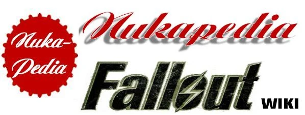
Rusted bottlecap - Jspoel
![]()
I want to keep it as simple as possible and pleasant for the eye with a rusted Nuka-Cola bottlecap. Seeing the enormous availability in the game people can see the relevance to the game. And just Fallout Wiki in the original Fallout font. More of less same style we had with The Vault. I 'leant' some images from other people like Doc and Sirota, they can have the credit. We should at least take care the logo doesn't destract too much from the content and the contrast should blend in well with the page.
- Update: I've enhanced the resolution of the image and the Nukapedia lettering. Hope that helps. Jspoel 18:08, January 20, 2012 (UTC)
Votes in Favour
- Agent c
- I didn't know you were an artist, J! 114.77.77.5
- More simplistic but nevertheless great -ΣΔLet's talk!
- Skål!
- BusinessMonkey I completely understand the idea, and approve of it, in case we don't come up with something that works better while being different from the status quo.
- Very simple and still makes it obvious as to what we are. My favourite. The Australian Kiwi 18:38, January 20, 2012 (UTC)
- badah bap bap bah... im lovin it The lone wanderer's bad-ass grandma
- Mrs Chebanger 20:46, January 20, 2012 (UTC)
- --Divine Paladin 23:09, January 20, 2012 (UTC)
- Hate Mail :D If it wasn't for Agent C's comment about saying how the pixels could be fixed, I would've said no. This one definitely gets my vote.
- The shadow seems to cut out a bit at the end, fix that and it's absolutely great!
- TheFullShrimp 09:22, January 21, 2012 (UTC) This i like, i like the bottle-cap, i like the text, and it's also so simple.
- MysteryStranger: Trust in the power of Infinity! 10:01, January 21, 2012 (UTC)
- Eddo36 13:39, January 21, 2012 (UTC) I like it
- Xxfallout turkeyxx 15:12, January 21, 2012 (UTC) thats a great design, nice and simple, gets the point across and not in weird colors...so why arent we using it yet?
- -- Paladin ACES 19:44, January 21, 2012 (UTC)
Votes against
- Sirota554 I think the bottle cap rust is too pixelated and I dont like how those two designs mix.
- Carinth sorry it's ok but something about it, just seems to plain and no feel for the wiki.
- OutOfTimer Wanna chat? 16:13, January 20, 2012 (UTC) I wish I could vote in favour but the design is so pixalated it makes the whole thing useless.
- Doc Incognito 22:31, January 20, 2012 (UTC) I mean no disrespect, but considering we disqualified one of Mr. YouTube's entries for being derived directly from the work of myself and Sirota, I cannot understand why Jspoel has submitted a logo under practically identical circumstances.
- That font and bottlecap just don't fit. Pony of the East 23:11, January 20, 2012 (UTC)
Neutral/abstain and comments/questions
Pixelation/execution can be fixed in the final version.Agent c 21:48, January 20, 2012 (UTC)
I wasn't aware this was taken from Sirota's design. 114.77.77.5 23:11, January 20, 2012 (UTC)
Doc, I agree that this one is close to the line; The Wording on the cap is different enough, and the vault boy is removed, but the cap does seem to be Sirota's cap underneath that by shape, but there do seem to be some differences in the colour. Also the "Fallout Wiki" is different This is different from the excluded entry in that was a straight cut/copy of two other peoples entries. At the moment, I'm inclined to put it on the "acceptable" side of the line, but would like to hear Sirota's and Jspoel's thoughts as to how close they feel their entries are to each other, is there a difference I've missed? Agent c 03:21, January 21, 2012 (UTC)
It's close yeah i mean the top is pixelated a bit mainly to cut out my design. But my design isn't just the bottlecap so I would say it is different enough for me. I still don't think it works but i can provide the original bottle cap sans design if asked. --Sirota554 10:16, January 21, 2012 (UTC)
Nukapedia Word/Nuke mark - OctaviusoftheNorth
Here is my take on the logo, hope you guys like it as well!
![]()
A new flavor to the mix, the same logo with a darker gray background. See if you prefer it slightly more.
![]()
Votes in Favour
- BusinessMonkey I actually like this. It's simple and would probably work well. Just as long as it doesn't make the site seem too anonymous.
- BILLYOCEAN Wanna talk? 19:21, January 20, 2012 (UTC)
- Plooto 20:16, January 20, 2012 (UTC) I love the simplicity and I think it would go well.
- Xxfallout turkeyxx 15:16, January 21, 2012 (UTC) if it wasnt for the radiation warning logo things, would have said no, but im just obessesed with those things
- This could very much potentially work! -ΣΔLet's talk! 22:00, January 21, 2012 (UTC)
Votes against
- The Australian Kiwi 23:14, January 20, 2012 (UTC)
- TheFullShrimp 09:28, January 21, 2012 (UTC) doesn't have the Nukapedia look.
- OutOfTimer Wanna chat? 20:01, January 21, 2012 (UTC) I'm sorry.
Neutral/abstain and comments/questions
- User:Carinth I like the design its just to general, hard to say without some reworking.
- Mrs Chebanger 21:51, January 20, 2012 (UTC)
- If it passes, it needs reworking. But it has potential. 114.77.77.5
- Hate Mail :D Maybe throw in a background and we got ourselves a logo.
General comments
Darn, thats a lot of entries to wade through. I think I've gotten everyone, and those who pointed me to a blog and sandbox, I think I got your comments too. Feel free to edit your own entry, but do not remove your entry or anyone else's comments - if you want to withdraw, please indicate it on the entry. Agent c 01:29, January 20, 2012 (UTC)
Sorry Doc, adding you now!!!Agent c 01:32, January 20, 2012 (UTC)
- Done, If I've forgotten you, please feel free to add yourself as long as you've made a submission in the prior thread. Please also feel free to reformat your own entry as you see fit, as long as your images don't become ridiculously sized.
Sirota: Re your Terminal logo, as you said you didn't want it to replace the Bottlecap logo I wasn't sure if you wanted to include it, as you got it on that page before the deadline, you may include it here. Other than that, I am going to get some sleep. Bon Chance! Agent c 01:40, January 20, 2012 (UTC)
I'd like to take this opportunity to say that changing the colour of Nukapedia to red is the only reasonable way to go. The present colour scheme is confusing. We should have our own identity and not blindly emulate The Vault. This fact should be reflected in the logo design. OutOfTimer Wanna chat? 16:05, January 20, 2012 (UTC)
I was just wondering why this isn't on the main wiki page for all to view, we are somewhat limited to a small voting pool here and I think it's a choice everyone needs to see on the mainpage when they come in. When you come to the mainpage the only mention is the old report from the 13th and the polling doesn't even appear anywhere. If we are gonna be democratic we should move this mainpage.--70.29.122.179 16:12, January 20, 2012 (UTC)
- It will be promoted in the Wiki News Digest, which will be posted later today. Agent c 16:32, January 20, 2012 (UTC)
- WND is up now.Agent c 18:01, January 20, 2012 (UTC)
Are you sure you can vote for yourself? Because that could be the vote which passes you through. It just doesn't seem right to me. 114.77.77.5 22:22, January 20, 2012 (UTC)
- Yeah, I have a similar sentiment. Presumably, entering a piece of art into this competition is a self-endorsement; why include a self-vote as well? Doc Incognito 22:26, January 20, 2012 (UTC)
- I've been chewing it over for a few hours since I've seen the first own vote; Balancing this is the flexibility in the contest rules - Noone is going to proceed or not proceed based on a single vote - in a tie, or near tie I'll extend the number of contestants that proceed. However on reflection, I think by posting an entry its implied that you're supporting your own entry, so no own votes will be included in the count. Agent c 23:22, January 20, 2012 (UTC)
- Sorry about that moved my comments about my pieces to neutral --Sirota554 23:48, January 20, 2012 (UTC)
- I've been chewing it over for a few hours since I've seen the first own vote; Balancing this is the flexibility in the contest rules - Noone is going to proceed or not proceed based on a single vote - in a tie, or near tie I'll extend the number of contestants that proceed. However on reflection, I think by posting an entry its implied that you're supporting your own entry, so no own votes will be included in the count. Agent c 23:22, January 20, 2012 (UTC)
- Yeah, I have a similar sentiment. Presumably, entering a piece of art into this competition is a self-endorsement; why include a self-vote as well? Doc Incognito 22:26, January 20, 2012 (UTC)
A number of people have requested that my submissions look rustier; once I find a stock image of rusted metal, I will gladly use it to scuff up my assets. Doc Incognito 23:15, January 20, 2012 (UTC)
I'll look for a nice background to go with the logo. I was thinking worn/rusted, but if anyone has some suggestions, drop a comment. ![]() Pony of the East
Pony of the East ![]() 02:01, January 21, 2012 (UTC)
02:01, January 21, 2012 (UTC)
Quick question for Agent c. The rules state that you can't submit major colour changes. Considering my submission is a silhouette, would adding one colour constitute as a major colour change? 114.77.77.5 02:14, January 21, 2012 (UTC)
- Is this a hypothetical, or do you have a specific result in mind? It probably would depend on how drastic it was. If its not hypothetical, if you can load up a proposal I'll take a look. Agent c 02:40, January 21, 2012 (UTC)
- Just hypothetical. I was wondering if by adding a colour and submitting a new version, it would breach the rules. 114.77.77.5 02:53, January 21, 2012 (UTC)
- I think the overall key point in the decision I'd make to include or exclude it is fairness. The basic concept is supposed to be "locked down" at this stage, so to allow a drastic change would require everyone to have an opportunity to resubmit and the whole vote process restarted for fairness to be achieved - the reason to do this would have to be immense before I'd consider doing it (DMCA or something perhaps).
- On the other hand, if the change is very minor like changing the shape of the cap in one entrants case, then the concept really hasn't changed, and no votes have probably been influenced either way.
- Cleaning up and improving execution like in Jspoel's case is also fine (even though it has influenced votes) because execution isn't supposed to be a criteria yet (likely entrants to proceed will be given an opportunity to create a "final" entry for part 2).
- In the Silhouette's case, my initial thoughts are that there's probably not a lot you can do to it before it stops being a silhouette, as such I probably wouldn't be inclined to accept much in the way of changes. But maybe you can come up with something I can't immediately conceive of, if you have half an idea in mind I don't want to discourage you from making an improved option; but I think you're probably looking at an uphill battle. Agent c 03:07, January 21, 2012 (UTC)
- Just as further guidance, I've accepted a change to a background/base colour that didn't effect the design (just the old design placed on a new background colour). Agent c 03:54, January 21, 2012 (UTC)
May I just remind voters to add a * before your vote. I've noticed a few users have forgotten. Thanks. 114.77.77.5 06:04, January 21, 2012 (UTC)
People who submitted their designs should not be allowed to vote down the submissions of others. You can leave a comment (and that's actually valuable since you're a designer yourself), but not vote something down. We already have a couple of votes against rival designs that seem to stem from the fact they're high in the polls. I propose these votes are moved to the neutral comments section. OutOfTimer Wanna chat? 13:58, January 21, 2012 (UTC)
- I am in favor of this, I've personally voted negatively on some and positive on others. But in adding our own artwork we are inherently biased. However since we are allowed to vote for or against multiple would we then not be allowed to show support for pieces we feel work as a secondary to our own biased opinion of our pieces. Either way If you need I'll make all my comments neutral comments. --Sirota554 14:32, January 21, 2012 (UTC)
- I can see the concern here. Generally, the votes against my submissions seem rational, and I would say the same of my own votes against others, but since the consensus seems to be going in this direction, I too will neutralize my downvotes. Doc Incognito 15:40, January 21, 2012 (UTC)
- Thanks for your understanding. I'm sorry for being a little harsh, but I believe this vote is extremely important 'cause we're creating a new brand. OutOfTimer Wanna chat? 19:55, January 21, 2012 (UTC)
Then I would also like to put forth that anyone that assisted or co operated together or in a group also not be allowed to vote on the designs they worked on or together on, it is the same conflict of interest, is it not? Those votes limited to neutral on such submissions.--Carinth 14:37, January 21, 2012 (UTC)
- It depends on the degree of Colaboration - if someone has helped you with perform a specific task, e.g. if I came to you and said I need help getting this effect to work, or how do I do this effect, then I think its okay, as the specific effect was your idea. A single line or so comment suggestion I also think is okay. However if there's collaboration on the idea to a major level on a design, then I agree that both should abstain. That said, given the flexibility in determining "winners", I'm not overly concerned about possible "Voter Fraud" from this angle.
- How do people feel about allowing folks to vote on their own option in the second, single vote phase?Agent c 15:24, January 21, 2012 (UTC)
There is a spelling error under "things to bear in mind" in the first point it says "additioonal information" just thought i'd point that out in case you cared to fix it. --![]() Paladin ACES
Paladin ACES ![]() 19:47, January 21, 2012 (UTC)
19:47, January 21, 2012 (UTC)
I'd like to mention one more thing that has been bothering me. I believe Sirota554 and Doc Incognito's designs are both brilliant and would serve this wiki well. I have a hard time choosing between them, however, as they both have their unique pros and cons. Sirota554's bottle cap is beautiful and has the Vault Boy on it - the ultimate symbol of the Fallout universe. Doc Incognito's submission, on the other hand, is a superb design of almost every detail of the whole website. I know some guy tried to combine your designs, but was rightfully shot down for copyright infringement (I support this decision). However, since I'm not familiar with the whole situation, does it mean that you simply don't want to work together or was the decision made by an admin on principle? I have to ask because I'll have a really hard time choosing between your two designs and believe combining the proposed website design and title with the red Vault Boy bottle cap would be brilliant. I also heard Agent c complaining about the red colour scheme. Does that mean admins will oppose the change? Can someone explain the situation to me or link me to the relevant discussion? Thanks. OutOfTimer Wanna chat? 19:55, January 21, 2012 (UTC)
- I had a version of mine with a red hue to the bottlecap, I felt the backgrounds were too incompatible and the first mashup was kinda shoddy and used an old version of my cap. I included the backgrounds on mine because I felt variety is better and I figure people can vote for whichever they want but I personally think that only a transparent background would work well. So I wouldn't throw a redder version of my cap onto a new background. --Sirota554 20:27, January 21, 2012 (UTC)
- At this stage, you don't need to choose between them; vote for both. As for the colour scheme, I can't speak for the admin team; for the best gauge, check the last thread and look at Jspoel's comments - he is an admin and did have some thoughts on that...Agent c 20:50, January 21, 2012 (UTC)
- Thanks for the info. I'm sorry if it was someone else that complained about the red colour scheme. I don't seem to remember well. Will read that last thread in a second. OutOfTimer Wanna chat? 20:57, January 21, 2012 (UTC)
- At this stage, you don't need to choose between them; vote for both. As for the colour scheme, I can't speak for the admin team; for the best gauge, check the last thread and look at Jspoel's comments - he is an admin and did have some thoughts on that...Agent c 20:50, January 21, 2012 (UTC)
- just wanted to know if we maybe infringing using an actual cap, more than likely the designers use our wiki and may take it in the wrong manner. That ebay post for the two cap designs above look remarkably similar to some entered, enough so that it may not be good.--Carinth 20:39, January 21, 2012 (UTC)
- I'm wondering if its the other way... That Ebay was only posted today. Vault Boy is Copyright Bethesda; Gstaff doesnt think us using Bethesda Copyright images will be a problem, but will be given an opportunity to vet. NukaCola could be another question... 20:52, January 21, 2012 (UTC)
I'm pretty sure we will ultimately be choosing between Sirota554 and Doc Incognito in the final stage. If anyone is interested in the discussion on the combined design, please read The Logo Forum Page. It includes such gems as Mr. Youtube claiming that at least he will get credit for putting them together. LOL I absolutely love the bottle cap and perhaps shouldn't complain since I'm no graphic designer, but having it green completely disqualifies it for me. And since Sirota554 and Doc Incognito explain in the above thread that they don't want to have their designs combined, the situation is rather sad. I love this wiki for God's sake and want it to succeed! LOL OutOfTimer Wanna chat? 21:12, January 21, 2012 (UTC)
- I added a blue cap have you considered blue instead of red?--Carinth 21:48, January 21, 2012 (UTC)
- No. That is too much of a change, and wouldnt be fair on everyone else. A slightly different shade I could pass, but this is a pretty big change now. Agent c 22:14, January 21, 2012 (UTC)
- Copying from talk as I want to work from a position of precedent:
Doc's was a subsitution and changed from a red, to a red ever so slighty different I'm not sure I can actually tell the difference on first glance; this just improved the execution of the existing concept. Your's isn't a substitution: its a new flavor. You've had 3 new flavors with the changed fonts which I kinda allowed on similar grounds to the Doc's (edit: "Corrected" but same general idea - but it was borderline!), so you've had a beneficial call too. Your intial entry didn't include alternative colours at the time of closure, whereas Sirota did (and if Sirota wanted a blue one now, I'd also turn it down; s/he could get a corrected red or a corrected lime green as a substitution, but not a completely new shade). Agent c 22:24, January 21, 2012 (UTC)
- Just to parahrase from the talk page, I still think adding the blue version as an additional option is too far at this point; however in the spirit of Wikiness, if a majority of entrants disagree with me and think its okay, I'll review the decision. Agent c 22:41, January 21, 2012 (UTC)
On combining our submissions: I wasn't exactly against the possibility, merely Mr. YouTube's attempted implementation of said combination. I have my own thoughts on a theoretical combination: in my mind, it would involve Sirota's bottle cap, reddened, with my "Nuka-Pedia" and the squiggle on top. However, I've one significant reservation: to my eye, Sirota's bottle cap shape and shadowing are far too realistic to have been Photoshopped; yet, the perspective is so perfect that photography is ruled out. This leads me to believe that the cap was created with 3D modeling software, but Sirota has stated that he used only Photoshop. Thus, I can only conclude that Sirota's bottle cap is an image from the Internet, which he imported into Photoshop. While I know that my submissions are entirely my own (with the exception of two royalty-free stock images from freestock and hatestock on deviantart.com), I am not sure that Sirota's are entirely his own. Doc Incognito 22:18, January 21, 2012 (UTC)