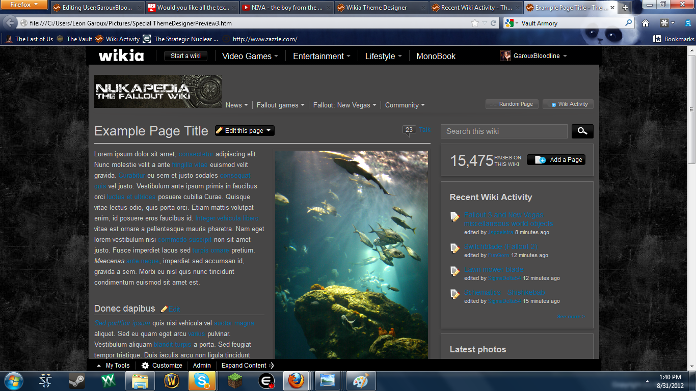
Hello, fellow Nukapedians! I come to you today with hopes of changing both our current background, and possibly even our current banner.
- As you can see here, this is what we have as our background and banner, right now:
 File:Nukapedia - Current Banner.png
So why am I wanting to change what we have now, when we've been using the same theme for so long? (Background - Years/Banner - Over half a year)
All of my points are purely my own personal opinion.
- Nukapedia seems to rely on bright and bland colours. This is not what Fallout is about. Fallout relies on dark and dreary colours; focusing on the destruction and rubble of the old world.
- Our current background is quite frankly as spartan and tasteless as they come. I've always been bothered with it, and I finally decided to make my own before the one we have now gives me eye cancer.
- I quite like our current banner. However, with darker colours like I'm suggesting, it will end up sticking out like a sore thumb.
Without further ado, I would like to present you with the themes that I've finished and that I am thoroughly pleased with:
I am working on more themes. Please check on this page regularly for possible updates.

Grunge Theme
Apocalypse(Smoke) Theme

Apocalypse(Nuclear Fire) Theme

Vault Theme

As I'm trying to keep the best interests of this wiki in my heart, it would be utterly unfair of me to not include as many options as possible when considering any significant changes to Nukapedia such as this. Because of this, I would also like to include a theme that our very own Administrator Gunny has introduced.


Two newer versions, each with a lighter background, one with the banner and button color stripped from the rusty reds in the bottlecap:

And a second with the banner and button colors stripped from the sandy colored background:

This is Energy X's first background proposal:


This theme only represents the background image
This is Energy X's second proposal:


This theme only represents the background image
Special thanks to GarouxBloodline and The Gunny for making these images!
For any of you whom are interested in the original banner we made before having to butcher it to get it to 150kb, here you go:

Comments
The background image of This Energy X's second proposal: is really cool I think is has all the old world goth city elements now in partial ruins that I personally would like to see. After all eventually a game will be set in or around an east coast big city.
If it's text area was white with black letters I would vote for it right now.
![]() SaintPain→ That was broke afore I got here." 02:39, November 19, 2012 (UTC)
SaintPain→ That was broke afore I got here." 02:39, November 19, 2012 (UTC)
- I would love to hear some constructive criticism! If you feel like something should be changed, let me know! If you have a certain theme you'd like for me to tackle, well then, let me know! Thanks for reading everyone, and I hope our work is to your liking!
 Some Assembly Required!
The font doesn't look right to me... It looks too 1980's rather than 50's.... Otherwise I like it. Agent c (talk) 19:18, September 1, 2012 (UTC)
- When I was using this font, I rather liked it because it reminded me of the style the Enclave or BoS would use. However, I understand your concern, and I am still actively searching for alternative fonts. I'll update this forum with another example banner if I find another appropriate font. Some Assembly Required!
Damn! Looks really great leon. My only concern is the vault logo. I'm not sure what we should do if we keep this. Maybe another contest? ![]() "THE WABBAJACK!" 19:23, September 1, 2012 (UTC)
"THE WABBAJACK!" 19:23, September 1, 2012 (UTC)
- Why is that a concern? Some Assembly Required!
The one we have now won't really fit in with the first theme. It would with the second though. The vault door is more of a "The Vualt" kind of thing though, isn't it? That's my concern. ![]() "THE WABBAJACK!" 19:29, September 1, 2012 (UTC)
"THE WABBAJACK!" 19:29, September 1, 2012 (UTC)
- Ausir doesn't have exclusive rights to Vault doors. ;) In any case, I put special care into the addition of a Vault door that doesn't look anything like The Vault's. Thanks for your feedback! And I'm glad that you like our designs! Some Assembly Required!
I know I told you earlier, Leon, but personally I don't think Fallout focuses on grimdark grim darkness of dreary doom - I think it has a larger focus on rebuilding the world, life resurfacing, the development and structure of societies and the positives and negatives of the human nature - Fallout 2 and Fallout: New Vegas displays this clearest. I'd personally prefer some happier colours, although muted and "apocalyptic". Hugs ![]() "Say 'ello to my little friend!"
"Say 'ello to my little friend!"
- I just created a theme I think you'll love, then. Keep an eye out for my next update! Should be in about 2 minutes. Some Assembly Required!
- Just added it in. Hope it's to your liking. Some Assembly Required!
- Just added it in. Hope it's to your liking.
The theme I cooked up is just a tool for me to learn more about applying .css to the site. It'll change quite a bit as I mess with learn thing. Anyone is welcome to use the .css code if they want, but I wouldn't say it's even remotely ready to be considered as a real theme for the site to go to. Thanks for putting it up there, Leon, but I reckon folks who are much better at graphic design can do a better job. The Gunny ![]() 20:28, September 1, 2012 (UTC)
20:28, September 1, 2012 (UTC)
- Well, I like what you've come up with, so far. A desert-esque theme certainly fits the Fallout bill. If you want me to take it down, just let me know. But if you really would like this as an option, then I'll definitely keep it up. Just let me know when you update it, and I will do accordingly! Some Assembly Required!
- No, that's fine. If anyone wants to try it out, it's a working .css you can copy. See the directions here: User_blog:The_Gunny/Gunny's_personal_wiki_theme. Since I'll update my .css from time to time, you may want to keep up with the blog. The Gunny 20:51, September 1, 2012 (UTC)
- No, that's fine. If anyone wants to try it out, it's a working .css you can copy. See the directions here: User_blog:The_Gunny/Gunny's_personal_wiki_theme. Since I'll update my .css from time to time, you may want to keep up with the blog. The Gunny
I'm not really digging the first one so much, Gunny's is pretty good. I'm pretty pleased with the one we currently have.--![]()
![]() 20:49, September 1, 2012 (UTC)
20:49, September 1, 2012 (UTC)
- I have to agree. While it was good enough in my opinion to put up here once I had a final product, it's definitely the one I like the least, at the moment. Some Assembly Required!
Can't say I'm fond of the dark background on the pages, it strains the eyes a bit. White is always the way to go behind text IMO. Limmiegirl ![]() Talk! ♪ 20:54, September 1, 2012 (UTC)
Talk! ♪ 20:54, September 1, 2012 (UTC)
- Personally, I wouldn't really agree with this. In response to the dark background, the text is made a brighter white to improve readability. It's actually easier to read for me than to have a white background with black text. After asking around and showing examples to friends on here and family here at home, (A couple who have very bad eyesight, as it runs on both sides of my family.) no one has ever complained about my themes being hard on the eyes. If a user actually finds these themes hard on the eyes and mentions it here, then I will see about creating a much lighter theme choice. Some Assembly Required!
- IDK if it's just me or not, but white-on-black is just intolerable. Unless a scheme is black-on-white I can't support it regardless of any other merit :/ 176.9.209.113 04:23, September 2, 2012 (UTC)
Well, I like them both. I also like the background we have now. I think the brown one you posted was nice, if I had to choose. ![]()
![]() 23:46, September 1, 2012 (UTC)
23:46, September 1, 2012 (UTC)
While I'm not against modification of the theme, I have a few gripes and preferences:
- I think that the text should be black-on-white, or otherwise extremely close to that; I feel that most other variations are unprofessional.
- I don't feel that that font is appropriate for a nuclear apocalypse. It says "Gears of War" to me- in fact, it might be the Gears of War font.
- The Vault-door-like logo looks very cool, but this site is no longer the Vault, and I don't think that should be used.
- I think that logos with transparent backgrounds (like our current logo) are cleaner, because of the way they blend in with the upper bar.
- I quite like the second of the three backgrounds.
![]()
![]() 23:59, September 1, 2012 (UTC)
23:59, September 1, 2012 (UTC)
- I would like to contest your points:
- Whether something looks professional is a matter of personal perspective. For instance, I think black on white is just as professional looking as white on black. Others feel differently, I understand that, and thus I feel this is not a legitimate matter. If you personally don't feel as if you like my choice, this is fine. But saying that it is not professional is a matter of bias. I hope you understand.
- You're right. It's the Jacinto font I'm using. It doesn't really matter. I chose it because it reminds me of the stylings the Enclave and BoS use. Whether the font is appropriate or not is another matter of personal perspective. For instance, the font is almost identical to what we already currently use here. There is minimal changes, with the exception of interior design for each letter.
- This one really annoys me. I understand why you feel the way you do for your other points presented here, but I do not like the suggestion that I should be artistically stifled just because our predecessors had something similar. And when I say similar, I mean that by barely. I took pains to make sure my banner looked nothing like The Vault's logo.
- Like I said, I like our current banner, as well. However, I need to modify my banners for a symbiotic relationship with the background. Hence, a transparent background doesn't look as good for mine. I've tried, and it looked a lot worse.
- Thank you very much, I'm quite happy with it, as well. Thank you for your criticism, and while I contested them all, I will still take them into account with the other projects I'm working on. Some Assembly Required!
Understood. I have no other points at this moment, but I want to highlight my use of "I think", "I feel", and so on. I understand that everything I've said is a matter of bias, which is why I did not use absolutes. I am not, by any means, saying that my points should be beyond reproach, because no one's opinions should shy out of reach of criticism. What I am saying is that I don't hold my perspective to be some objective metric of judgment. ![]()
![]() 00:55, September 2, 2012 (UTC)
00:55, September 2, 2012 (UTC)
- Sorry if I came across as overly-blunt. I think I took what you said a little more roughly after reading your third point. I really do appreciate your criticism though, and I will be taking it into my consensus for new designs. I admit to having trouble making a lighter coloured theme that can take advantage of black text on white. I'll keep working at it. Some Assembly Required!
- No worries, mate. And no matter what I say, that Vault Door remains kickass awesome looking. 03:21, September 2, 2012 (UTC)
- No worries, mate. And no matter what I say, that Vault Door remains kickass awesome looking.
(←)
I can see you did you spent time and effort in the new background and logo. Especially impressed by that Vault door. Like you say, it's nothing near the old Vault logo. I'd say the first examples two look rather well, third one has too little color difference between outside banner and the inside. I am worried though about readability with changing from white background/black lettering to dark background/light lettering. I'm pretty sure the one we have now will always have the best readability. Reading from your images looks pretty difficult and besides that, I don't see an example with infoboxes. How would that look? And I still very much like the tiled broken light green banner we have now. We may have had it a long time, but it's for a reason it has lasted that long. It's so easy on the eyes (Bethesda has it too) and I'm not bored by it. I can edit for hours and not get strain on my eyes. Ok, you say the current design doesn't have the dark Fallout feel to it, but Scarface got me thinking about that and I don't think it's really needed and the visitors don't mind is my guess. They will probably prefer the ease of reading information. I know what we have now and it's working well, so I'm very cautious to major appearance changes. If you can I still would like to see how it looks with infoboxes and you can show us a few more examples, but as said, I'm not convinced yet. Gunny's banner isn't too bad either but has a bit too much contrast and personally I'm not crazy about the desert look. Jspoel ![]() 01:11, September 2, 2012 (UTC)
01:11, September 2, 2012 (UTC)
- I'm still working at getting those extra examples for you. I already have the designer wiki made up, but I'm still having to go through the process of migrating the templates needed to create further example pages. I will try my best to have those made up by tonight. If not by tonight, I don't have much to do tomorrow, so I should be done by then, no matter what. Some Assembly Required!
Maybe you can paint a bottle cup (insead of 42) in the center of that vault door?--Theodorico (talk) 02:21, September 2, 2012 (UTC)
- How funny that you should mention that. Using a bottlecap in the center was my original idea, but for some reason, I couldn't get the damn thing to look right. (Nor could I find a proper colour scheme to fit the Vault door behind it.) Some Assembly Required!
- How about coloring the whole door in red/crimson? Like, whole door is a bottlecap? --Theodorico (talk) 02:34, September 2, 2012 (UTC)
- That's a pretty good idea, if I can make what I have in my head. Maybe instead of Crimson, I can make it more of a Sunburst Cherry colour. I'll see if I can come up with something good tonight. Some Assembly Required!
- That's a pretty good idea, if I can make what I have in my head. Maybe instead of Crimson, I can make it more of a Sunburst Cherry colour. I'll see if I can come up with something good tonight.
- How about coloring the whole door in red/crimson? Like, whole door is a bottlecap? --Theodorico (talk) 02:34, September 2, 2012 (UTC)
I like all of what has been offered & I like what we have now as fine to.
- OK, I vote ~ the one with the vault door
I like the banner, and I like theme #1. ~ Toci ~ Go ahead, make my day. 05:39, September 3, 2012 (UTC)
Yes, this is what I've been waiting for. The first background is the one you should go with, and the vault door is a nice touch. However, I'm sure some don't like the grittiness that this theme brings. For what is seems, our background is still representing Fallout 3, with the Green streaks. If the First option isn't picked, then the desert background with original symbol would be preferable.--![]() A Safe People is a Strong People! 15:14, September 4, 2012 (UTC)
A Safe People is a Strong People! 15:14, September 4, 2012 (UTC)
- How is our current background "representing Fallout 3"? --Skire (talk) 15:36, September 4, 2012 (UTC)
- Green texture? To refrase myself, It shares the color palette as Fallout 3, and Fallout: New Vegas' dusty orange color would make more sense, since majority of hte games are set in the west coast desert.-- A Safe People is a Strong People! 16:20, September 4, 2012 (UTC)
- Green texture? To refrase myself, It shares the color palette as Fallout 3, and Fallout: New Vegas' dusty orange color would make more sense, since majority of hte games are set in the west coast desert.--
First background suits the vault door, and is my preferred choice. As opposed to the second which doesn't seem very metallic, with metallic textures fitting also with the door. The current background is rather bleh, though only due to what it's mixed with. It suited the prior logo, the colours were similar, and it suits out current green theme. In terms of current logo, oranges and browns don't really fit with a green theme at all, IMO.
The banner on it's own could fit with the existing background with a little tweaking of the background colour, but since we've been presented with better examples of a background. In terms of Gunny's design, the background and colour scheme is ore suited to our existing logo, though I'm not particularly fond of the white text as the infobox title, it looks rather bright on the background. If it was a block colour background, it'd remove this brightness. Overall, like background #1 the best out of three, and dig the logo/banner. Gunny's background suits the current logo but the infobox colours could perhaps do with some tweaking. --![]() Talk 15:40, September 4, 2012 (UTC)
Talk 15:40, September 4, 2012 (UTC)
I vote for the secondary option. Much more pleasing to the tunnel visioned eye.--Eden2012 (talk) 10:47, September 8, 2012 (UTC)
I have to agree with Limmiegirl, the white text on a grey background is hard on my eyes and trying to read the blue links on the grey background is even worse =/ I really like Gunny's theme idea, but I don't think that that theme would be right for a Fallout series wiki. To my eye, the green in the current theme works well to represent the Fallout series since it's close to the green in the character sheet backgrounds from Fallout 1 and 2 as well as close to the default PipBoy green from Fallout 3. IMO, the orange/amber colors you see in New Vegas' PipBoy color scheme don't really match the other games well, so it seems weird to go with that in a wiki that's for the entire series. Librarymouse (talk) 14:46, September 13, 2012 (UTC)
- I can almost 100% assure you that the only reason it's hard on your eyes is because you're not full screening the examples I posted above. If you want a perfect example of what the darker themes would look like in full-screen, just visit the Skyrim Wikia. It's actually easier for me to read off of their theme than ours. Some Assembly Required!
- Quick survey of the Skyrim Wikia says nope :P I can handle it for menu bars, but trying to read a full page of white text on a grey background makes my eyes very unhappy. The only time black text on a white background bothers me is when the computer screen is the only light source in the room. Librarymouse (talk) 15:03, September 13, 2012 (UTC)
- Hmm. I haven't had much luck, but I'll keep trying to create a lighter theme that fits the Fallout atmosphere. I guess this is an issue that won't please everyone, though. Some people like black on white, some people like myself prefer it the other way. (To me, having a bright background is what puts stress on my eyes.) Some Assembly Required!
- Hmm. I haven't had much luck, but I'll keep trying to create a lighter theme that fits the Fallout atmosphere. I guess this is an issue that won't please everyone, though. Some people like black on white, some people like myself prefer it the other way. (To me, having a bright background is what puts stress on my eyes.)
- Quick survey of the Skyrim Wikia says nope :P I can handle it for menu bars, but trying to read a full page of white text on a grey background makes my eyes very unhappy. The only time black text on a white background bothers me is when the computer screen is the only light source in the room. Librarymouse (talk) 15:03, September 13, 2012 (UTC)
After doing a mediocre amount of digging, the message for light text on dark backgrounds vs readability is instantly and unanimously, uncertain. Following a news report I heard before, it would seem black text on white is preferred by the human eye, whether due to familiarity or through eye anatomy is unclear to me and the webpages I looked up momentarily.
However, darker backgrounds do indeed increase the lifespan of monitors and as such are more popular on the world-wide-web where there is no ink cost to be worried about and darker backgrounds actually save from further cost.
I would like to go on to say however, that I have a hard time reading inverted text but more specifically, non-inverted text. Black and White are direct inverses of each other but red and black aren't. What that means is that I think that white should be the standard font color and not something like grey or yellow in the event that we choose to go through with a darker background.
This site best sums it up. http://www.transio.com/content/why-you-shouldnt-use-white-text-black-background
Semper fi Leon! --The Ever Ruler (talk) 21:13, September 16, 2012 (UTC)
Assuming copyright infringement isn't an issue with the vault-door style logo, I think it is professional and suits the wiki well. Combining it with Energy X's background would be acceptable. That being said, I also like the current background as it is similar to an in-game texture, something that none of the proposed backgrounds seem to contain (with the possible exception of Gunny's). I think an attempt to emulate the texture of a vaults interior walls along with the proposed logo would be the best combination if a change is decided upon. ![]() Apocalypse Now! 07:47, September 20, 2012 (UTC)
Apocalypse Now! 07:47, September 20, 2012 (UTC)
- I've already addressed the supposed copyright infringement fear. For one, Ausir does not own the Vault door image. Second, my version of the Vault door looks nothing like his. And third, Bethesda/Zenimax don't own the Vault door concept, either. Vaults have existed long before Interplay ever made the first Fallout, and this includes the same type of door I'm using. So I'm really tired of hearing people throw the copyright infringement issue at me. It's not a fear based in reality, and I'll have none of it. As for the rest, we'll have to see. I'm waiting to see if there are any further entries before I continue. Some Assembly Required!
- Leon, I do not appreciate the tone of your reply, considering I was offering the constructive criticism you requested. I understand your frustration at having it brought forward again but it is an important issue that needs to be addressed. There is something called substantial similarity, which takes into context works that are based on an original design which may still infringe upon copyright despite it being altered . I do not know what Ausir/Bethesda own, but I was merely voicing my concern. I only wish for all options to be addressed so any potential conflicts can be avoided. Apocalypse Now! 23:23, September 20, 2012 (UTC)
- I just get really defensive when such prospects are thrown at me. I guess I feel like people think I'm stupid when they suggest that I might be breaking the law or violating some agreement. So I'm sorry for wording that in such a direct way. If it makes you feel any better, I'll send it to Ausir to review. Some Assembly Required! 23:29, September 20, 2012 (UTC)
- I do not doubt your intelligence, but not everyone knows everything, including myself. I think it is best if these issues are brought out in forums such as this, so we can use our combined knowledge to arrive at the best possible solution, while also limiting any future issues to a minimum. I think contacting Ausir is an excellent idea, if on the off-chance he does have an issue with it it can be remedied before the different formats are taken to a community vote. Apocalypse Now! 23:50, September 20, 2012 (UTC)
- I do not doubt your intelligence, but not everyone knows everything, including myself. I think it is best if these issues are brought out in forums such as this, so we can use our combined knowledge to arrive at the best possible solution, while also limiting any future issues to a minimum. I think contacting Ausir is an excellent idea, if on the off-chance he does have an issue with it it can be remedied before the different formats are taken to a community vote.
- I just get really defensive when such prospects are thrown at me. I guess I feel like people think I'm stupid when they suggest that I might be breaking the law or violating some agreement. So I'm sorry for wording that in such a direct way. If it makes you feel any better, I'll send it to Ausir to review.
- Leon, I do not appreciate the tone of your reply, considering I was offering the constructive criticism you requested. I understand your frustration at having it brought forward again but it is an important issue that needs to be addressed. There is something called substantial similarity, which takes into context works that are based on an original design which may still infringe upon copyright despite it being altered . I do not know what Ausir/Bethesda own, but I was merely voicing my concern. I only wish for all options to be addressed so any potential conflicts can be avoided.
Front page Improvement...
I've been experimenting with adding a slider for each of the 4 main games to the front page template. You can see a slightly mangled version of the front page here that shows it in effect. It would need different graphics selected as the strech and crop of the box art doesnt seem to work for it as is, and we may have problems come F4 (the documentation suggests only 4 images will work), but I think it adds something dynamic and graphical to the front page, plus the space under the slider would seem to fit an extra couple of (cut) games. I like the effect of something big and graphical there, but aren't sure this is it. Any suggestions on getting a similar concept on the front page? Agent c (talk) 21:30, September 5, 2012 (UTC)
If the "Extras" is to much to do
Well to be honest I am happy with the background we have. Why force a change? If it is not broke.....
![]() SaintPain→ Look for me Dec 22 Y'all know what I'm say'n. 22:41, September 5, 2012 (UTC)
SaintPain→ Look for me Dec 22 Y'all know what I'm say'n. 22:41, September 5, 2012 (UTC)
It would be nice if you could some how salvage the logo shown under extras. If the resolution is to high maybe you could adjust it. Either way, nice work on all of them. speaking for myself, I will be OK with what ever you folks decide even if that means keeping it the same.
![]() SaintPain→ Look for me Dec 22 Y'all know what I'm say'n. 02:31, September 8, 2012 (UTC)
SaintPain→ Look for me Dec 22 Y'all know what I'm say'n. 02:31, September 8, 2012 (UTC)
Update
The first vote will be delayed! I don't feel right pushing through such a large change without first making sure if the community feels like getting involved. I want there to be more options aside from mine, and I'll be looking forward to seeing entries from you all! I will not push this discussion into the voting stages until I have at least five other participants. Not sure how long that will take, but I will continue to advertise this proposal until we get a proper community involvement. This page will be updated on a weekly basis to keep community awareness. ![]() Some Assembly Required! 16:32, September 17, 2012 (UTC)
Some Assembly Required! 16:32, September 17, 2012 (UTC)
- If I get the time, I'll work on the theme I started a bit. I took note of the problems with the contrast, so I'll lighten the background and I'm not happy with the banner and headline colors. If I get something worthwhile, I'll give you a shout so you can update it. The Gunny 20:48, September 19, 2012 (UTC)
- OK, 2 new screens are up in the section above, with a few changes. I'm open to suggestions, if anyone has some. The Gunny 01:31, September 20, 2012 (UTC)
- OK, 2 new screens are up in the section above, with a few changes. I'm open to suggestions, if anyone has some. The Gunny
Update 2
We now have two more entries! I'm currently only looking for an additional two more entries before I take this into the voting stages. Make sure to participate if you want a hand in these possible future changes! ![]() Some Assembly Required! 06:35, October 2, 2012 (UTC)
Some Assembly Required! 06:35, October 2, 2012 (UTC)
- With the changes being made tomorrow, which will affect how our background is sized and distributes, we'll officially be able to go into the voting stages once we get our final two entries. Some Assembly Required! 00:27, October 3, 2012 (UTC)
I have been working on some book ends and a matching tiny banner but with the new wiki update things I've tested at other sites. They do not fit any better.
- I agree the central "Main edit area" should be white back ground with black text. It is crisp and easy to read.
If we can not properly place book ends, IMO, maybe what we have might be O.K. as is until somebody works out the best dimensions for book ends and the sites mini banner.
- If somebody could work out the details for size and placement of new site book ends we could rotate the themes with the seasons, holidays and other more site specific occasions.
What do you think ?
![]() SaintPain→ That was broke afore I got here." 10:35, October 5, 2012 (UTC)
SaintPain→ That was broke afore I got here." 10:35, October 5, 2012 (UTC)
Well, it might be good for just some holidays, like Christmas. It would be hard to find Christmas with Fallout that isn't fan-fic image, however. Energy X ∞ 23:08, October 5, 2012 (UTC)
- I doubt much work would be needed for a Christmas theme, just put a Santa Claus hat on the logo (attached to the side of the proposed vault-door) and that should sate the "requirements". Looking at the World of Warcraft wikia page, it does makes use of (albeit in-game, but coinciding with RL holidays) themes for their logo, but keeps bookends the same throughout, we could apply that here and not end putting too much effort in to it.
- As a quick example:

- Gothic NekoNeko's Haunt 13:09, October 6, 2012 (UTC)
- As much as it pains me to say this, I'm afraid we wouldn't be able to use such a large banner. That's the reason why I had to butcher the original to get it small enough to fit as is in the example themes I provided. Some Assembly Required! 18:02, October 10, 2012 (UTC)
- As much as it pains me to say this, I'm afraid we wouldn't be able to use such a large banner. That's the reason why I had to butcher the original to get it small enough to fit as is in the example themes I provided.
New Theme
It took me a long time, but I finally managed to come across a good stock image that I could work with to create a sort of 'Vault Theme'. It looks like plain gray in the example image, so I strongly encourage you to full view the image so you can see the textures properly. I hope you all enjoy it! ![]() Some Assembly Required! 17:58, October 10, 2012 (UTC)
Some Assembly Required! 17:58, October 10, 2012 (UTC)
I respectfully submit the following for consideration.


The matching bookends can be seen on my talk page. They turned out a bit grainy so I would welcome any aid from any body with a better photo editor program that could maybe make them more crisp. For me it's not about getting credit so by all means if you like the concept please feel free to fiddle with them all you like. I encourage all to go wild with it. ~BD
![]() SaintPain→ That was broke afore I got here." 02:17, October 15, 2012 (UTC)
SaintPain→ That was broke afore I got here." 02:17, October 15, 2012 (UTC)
The concept was nukapedia bottle caps randomly dropped on desiccated, toxic waist soil with cobwebs and dried weeds thrown in to hint at age. With some collaboration it could be some thing memorable if not for always then maybe just for Halloween, it dose feature fall colors... Have fun with it.
![]() SaintPain→ That was broke afore I got here." 06:28, October 15, 2012 (UTC)
SaintPain→ That was broke afore I got here." 06:28, October 15, 2012 (UTC)
Tested it, and can you bright under the Fallout word? It is a bit difficult to see that word. Energy X ∞ 10:15, October 15, 2012 (UTC)
Come the 1st of next month I plan to buy one o those "write on PC" screen art tool boards. But for now my skill and tech savvy is weak. As I said before.. Please, if you can tweek it remold or punch it into a better shape ~ PLEASE go for it.help
I am just here to help.
Have fun with it ![]() SaintPain→ That was broke afore I got here." 10:28, October 15, 2012 (UTC)
SaintPain→ That was broke afore I got here." 10:28, October 15, 2012 (UTC)
Here, did some experiments with it. Energy X ∞ 10:40, October 15, 2012 (UTC)

Comments on progress
To be honest, I'm not too happy about the results so far. I appreciate the efforts that has been put in to this, but it hasn't been thought over well enough I think. The proposals for dark aren't that good, because they're just showing how it looks in the theme designer and not how it looks on pages with infoboxes, tables and such which have a light beige color. Dark grey and beige don't go well together. I did some experimenting on my 100k edit wiki and there you see how it looks. I couldn't get the main infobox to work but you can see in the inventory table it has a bad contrast to eachother. Before any progress is made here it would need more experimenting with colors. Gunny's example is somewhat better but I don't like the desert look (sorry Gunny). Light tiled green still works much better for me and together with the white it's very easy on the eye. And Saint thanks for trying, but the quality of the bookends/logo is really not up to standard and fuzzy. If the site's appearance is going to change here, it needs to be professional, of high quality and tried out to in detail. We are one of the biggest wikis, with thousands of visitors a day, so such a major change is not to be taken lightly. That's my take on it. Jspoel ![]() 17:13, October 15, 2012 (UTC)
17:13, October 15, 2012 (UTC)
- You might want to turn the transparency off. Some Assembly Required! 17:20, October 15, 2012 (UTC)
- Also, can you make me an Admin there? I will show you what the info-boxes and the like will look like. Some Assembly Required! 17:23, October 15, 2012 (UTC)
- You are now an admin there, Leon. Jspoel 17:29, October 15, 2012 (UTC)
- You are now an admin there, Leon. Jspoel
- Also, can you make me an Admin there? I will show you what the info-boxes and the like will look like.
A transparent logo is the best type. All of the logos (banners whatever you want to call them) have backgrounds behind the text and don't sit well as a result. --Callofduty4 (talk) 17:31, October 15, 2012 (UTC)
- Great, I tried to start a wiki when I first started this forum to get these examples made for you, but the templates I was merging over weren't working right for me. So this will give me a chance to finally work on them. I won't be able to work on them right this second, but I'll try and get started tonight. Some Assembly Required! 17:32, October 15, 2012 (UTC)
- Great, I tried to start a wiki when I first started this forum to get these examples made for you, but the templates I was merging over weren't working right for me. So this will give me a chance to finally work on them. I won't be able to work on them right this second, but I'll try and get started tonight.
Don't change a thing
None of the examples given are better than what you guys have now. As a casual visitor, just leave it be. --Jimeee (talk) 14:02, October 16, 2012 (UTC)
- The real problem is, while it's my opinion that our current background is an absolute spartan eyesore, it's a fact that it's also merely a default Wikia skin. Seems to me we should have created our own background a long time ago to help create our own identity. Some Assembly Required! 14:08, October 16, 2012 (UTC)
- Scarce few people come here for the identity. People come here for content. People looking for Fallout content don't come here and go, "man, I wish this place had an identity." They come here and go, "where's the content?" There's a reason that every serious website where you read a bunch is black text on a white background. Overwrought themes scare people off. While I think it's important that you are having these feelings, in this case this isn't about the 'status quo' or 'creating your identity'. This is about 'access'. Only a tiny handful of people even know this is a "default" anything. The content is your identity. Content is king. Person of Refinement (talk) 17:45, November 5, 2012 (UTC)
I don't hate what we have now, but yeah having the options to change it up now and again or just stand out as Bloodline said, well that strikes me closer to home. I'm always in favor of more creativity. Not to "defy" the status quo but just to mix things up. So I guess I'm with GarouxBloodline on this one. What we have is OK, with so many talented folks around.. I know we can do better than the status quo.
![]() SaintPain→ That was broke afore I got here." 14:34, October 16, 2012 (UTC)
SaintPain→ That was broke afore I got here." 14:34, October 16, 2012 (UTC)
So far all the instances besides Gunny's have white-text/black-BG, which like I already mentioned is absolutely and literally unbearable for me. So if the vote came to at this stage I'd actually vigorously support the status quo rather than risking turning the wiki into a place I couldn't read, let alone edit... Limmiegirl ![]() Talk! ♪ 17:14, November 3, 2012 (UTC)
Talk! ♪ 17:14, November 3, 2012 (UTC)
New question
When the vote for new themes comes up, how should we vote? In normal conditions it would be one theme (voting to yes/no/neutral), but since there are multiple ones, should we limit that user can only ![]() vote for only one theme? Energy X ∞ 17:08, October 25, 2012 (UTC)
vote for only one theme? Energy X ∞ 17:08, October 25, 2012 (UTC)
- Vote will be set up soon. I am just waiting for Wikia Staff to help me with one last thing at the test wiki I set up, and I'll be starting up the vote. The way it will work is the vote will be set up into three segments:
- 1st Vote - Keep everything the same. This one is pretty self-explanatory.
- 2nd Vote - New Background - Separate vote castes will be set up for each individual theme choice. Only one vote per user.
- 3rd Vote - New Banner - Essentially following the same rules as the previous vote.
- If either the background or banner ends up being changed after the vote has passed, another vote will be set up exactly one month afterwards to make sure that the changes that were made are really to everyone's liking. Some Assembly Required! 17:18, October 25, 2012 (UTC)
- If either the background or banner ends up being changed after the vote has passed, another vote will be set up exactly one month afterwards to make sure that the changes that were made are really to everyone's liking.
Mine did not come out as I had hoped. So first off I wish to formally recall my submission. I am out of this running.
As per how to vote. The standard vote system has worked well enough.
- Once it is all worked out I would support the idea for special event or seasonal challenges to temporarily display a new look.
![]() SaintPain→ That was broke afore I got here." 17:45, October 25, 2012 (UTC)
SaintPain→ That was broke afore I got here." 17:45, October 25, 2012 (UTC)
I like it the way it is now so please LEAVE IT BE. Thank you.--Hellrazordirty ([:Please support me by downloading my Ultimate Hardcore Fallout 3 Gamesave here]) 00:21, October 30, 2012 (UTC)
- As much as I'll never understand why people would like a background which uses an image of cement, I'll still take your opinion into consideration. However, keep in mind that a vote will be enacted soon, and I would still love opinions on how we can improve our image to visitors here, even if you don't approve of the options made available. GarouxBloodline
Halloween Nipton skin
As I have said, I am in favor of holiday effects but with this Nipton skin that I assume is in honor of Halloween I am having issues.
- Maybe as a skin it would work better just "Centered" I think this one might be set to post multiples of the same image and it is scrambling user pages.
Is everyone having profile issues ? Mine is scrambled and the few other members profiles I have checked look just as bad.
Is this just a glitch or dose this skin need some fine tuning ?
- On article pages it would be better to read if it was more transparent.
- On user profile and talk pages every thing is just wrong.
I like the image. I really do and I do not wish to disrespect anyone's efforts to show some Halloween spirit. It would just work better if split and re-sized into book ends. As it is, it is just intrusive and unless I am just having a glitch on my end, profiles and talk pages are caused to fail.
Could we consider Book end images over new skins ?
![]() SaintPain→ That was broke afore I got here." 19:55, November 1, 2012 (UTC)
SaintPain→ That was broke afore I got here." 19:55, November 1, 2012 (UTC)
Since nobody else I asked to upload the background theme did it, I had to pick one of scarier images (although there were some complications, like it didn't *want* to upload or too much resolution). But I am no image wizard like Jspoel. Energy X ∞ 20:05, November 1, 2012 (UTC)
@Energy X I never meant to assign any kind of blame. The settings just need work. I bet if the image was set to "Center" it would work.
- It's all just something to think about before Thanksgiving, X-Mass and so on.
![]() SaintPain→ That was broke afore I got here." 20:19, November 1, 2012 (UTC)
SaintPain→ That was broke afore I got here." 20:19, November 1, 2012 (UTC)
Guys, don't do this.
Any 'serious' informational website (in the history of everything) that has a dark background with light text is, at best, harder to navigate and read and, at worst, a complete and utter laughingstock. For instance, go cruise the Skyrim wiki for a while; like go read stuff for 20 minutes. Then head back over here. It's like your eyes just got a breath of fresh air. It's terrible over there: it's harder to read and it simply doesn't seem as serious. Please do not do this. While it's aesthetically "tough" or whatever, so you get to feel like a supercool ninja while reading stuff, dark backgrounds with light text are UNEQUIVOCALLY harder to read, always. It's fine if you're making, like, an Oakland Raiders website, or a website for your death metal band, but come on, guys. This site is a freaking hallowed encyclopedia - one of the biggest for any video game ever - can we keep it at least somewhat mature and serious looking, and in the most readable format possible?
And then the Aliens Cold Steel theme or whatever. It looks beautiful, but no. No. No. It's in direct contradiction to the spirit of the game. I know Fallout's an RPG and some players like to pretend they are ruthless high tech space marines when playing, and that's fine, but you shouldn't force that narrative on people at the wiki. The clear edicts in the Fallout universe are that 1) there is an underlying funkiness/goofiness to the ominousness, and 2) nearly every single thing in the game, from the architecture to the technology to even the attitudes of the NPCs - are 1950s retro-futurist. Aliens Cold Steel theme, or anything like it, is 90s Space Horror Movie - and it's flatly out of place.
I came here a yearish ago when this site was changing its name. I lobbied heavily for Nukapedia. I won't do as much this time around since I'm not a regular contributor. While I want to, I just can never find the time to become a regular part of the community, so I feel I should back off after this. I just can't stress enough how most of the proposed designs have extreme taste-level issues and readability issues. Maybe that reflects the feelings of the majority of the community - maybe you guys like 90s space marines and death metal websites. I'd just hate to see this site forget/ignore the spirit of the Fallout universe just because we're getting antsy for some kind of change, or because we think "dark stuff" is tough.
If you guys are wanting change, my vote is to at least keep in theme. The logo jspoel made I think is amazing. I don't know why anyone would want to ditch every last vestige of a reference to Nuka Cola (by just going purely vault themed or whatever). The deserty background looked sort of cool. I like the idea of updating the theme from Fallout 3 green/grey to Fallout NV red/brown.
Thanks for reading, ---Person of Refinement (talk) 17:23, November 5, 2012 (UTC)
- I agree entirely with the black background issue. Limmiegirl Talk! ♪ 18:11, November 5, 2012 (UTC)
Whilst I appreciate the work that has gone into this, and I'm no lover of the current background, I don't quite see enough to warrant a change at this point... I think we need to keep looking. Agent c (talk) 19:10, November 5, 2012 (UTC)
- First of all: Black on white vs White on black is a battle that can never end up pleasing everybody. Some people find one harder to read, while some people find the alternative better suited to their tastes. For instance, myself: It's hard on my eyes to have a bright background causing me to squint to read the black lettering.
- This also goes for professionalism. It's a matter of opinion which alternative fits better.
- None of my themes are death metal/space marine oriented. To say such a thing is a rather rude way of depreciating my works without knowing what you're really talking about. The one you say looks like a space marine theme is in reality a stock image I modified to resemble the walling used in Vaults; which are a focal point in the Fallout universe. As for the what you think looks like death metal themes, Fallout embraces an atmosphere of desperation and fear, building into a gothic design. (DC is a perfect example, along with many locations in the original games such as the GECKO power plant and Necropolis.) That is what the darker themes are suppose to embody; with even the title stating what they represent, if anyone has bothered to read them. The only real game that doesn't embrace this atmosphere as much is Fallout: New Vegas, since it's central theme is that of re-building and politics.
- This will be going into the voting stages soon. Wikia Staff seems to be ignoring my messages, so I'll try and have a user such as Gunny/Theo help me out with my example wiki. Once that is finished, I will ask the community one last time if they feel like contributing any further. I've been stalling the voting stages because I'd have hoped more alternatives would have been presented. But I see that is not the case. I admit to my themes not being the best suited choices for Nukapedia. However, they are better than the theme we have now, which is a default Wikia background which consists of cement. Talk about boring and having nothing to do with Fallout. We need to create our own atmosphere instead of siphoning off of something that Wikia provided to us when we first started up. If people don't like how the new theme works, if a new one is instated after the vote, then I would be more than happy to see people put forth their own works and try to make Nukapedia's background better. I will try and have the vote set up before this weekend. If any of you are not happy with the themes presented here, then I urge for you to create you own, or have a friend create one for you. GarouxBloodline
We can't keep having these sort of votes every 6-12 months, Its just going to get tiring and I still have bad flashbacks from the logo vote. Whatever change we make I think it has to be on the assumption that it is going to be long term, not just until something better comes along. The Background doesn't make an atmosphere - we create that through our articles, and how we talk to one another... I'm not saying that the look isn't a part of this, but its not the whole show...
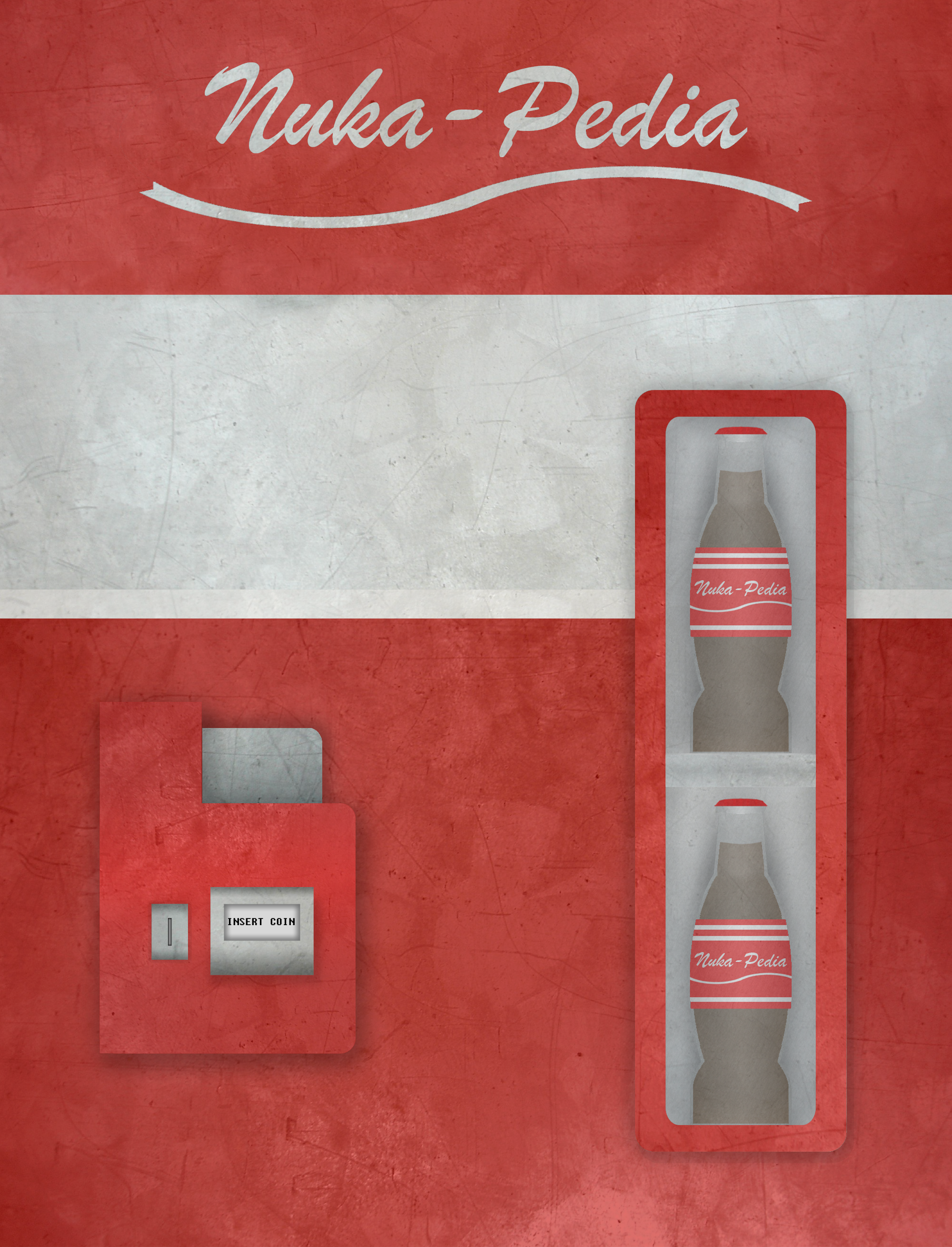
I'm wondering however is there any chance we can look at how this compares to Doc's designs from the Logo competition, with the NukaCola machine. I remember this being brighter than the dark ones and wonder if it might help resolve the issues that POR sees... Agent c (talk) 21:02, November 5, 2012 (UTC)
- Never said it was the entire kit and kaboodle. What I am saying is that it is important to have a site to reflect the content that it holds. Right now, one of those flaws is in that we've been relying on a spartan background that has nothing to do with Fallout, and is used on god knows how many other wikis seeing as in how it used to be a default skin when Ausir first started The Vault up on Wikia. As for the Nuka Cola theme; I say any alternative added will help us choose a theme that the majority can live with. However, I warn you that Nuka Cola has always been a very very minor aspect in Fallout; only really being touched up on in Fallout 3. Personally, I wouldn't suggest that as the influence to represent Nukapedia. As for having a vote every 6-12 months, sometimes that just can't be helped. Innovation is necessary, at times, and it's just something for all of us to tough through. (This certainly hasn't been easy on me, creating all of these themes and constantly trying to convince others to chip in. I wanted to have this vote going for over a month now.) GarouxBloodline
- I disagree that the cement has "nothing to do with Fallout". It has as much do to with it as metal, in being a major construction material in ruined buildings, and also being reminiscent of the building materials used in Shady Sands and Vault City. Agent c (talk) 21:12, November 5, 2012 (UTC)
- Using that logic, you could justify just about anything, from a background consisting of dirt, to a background consisting of the sky as being relevant to the Fallout universe. In any case, it doesn't represent Fallout. Maybe if the theme was specifically created for The Vault, it would hold more merit. But it was merely a generic background with no original intentions to be used on this wiki. GarouxBloodline
- As I understand it, and correct me if I'm wrong, but the tiled background image is a piece of art from a wall texture in Fallout 3. It is not a stock wiki image. At least it's not available on my wiki. Just thought I'd clarify that point. The Gunny 00:39, November 6, 2012 (UTC)
- Well, if you look through the history, you'll see that Wikia were the ones to add our wiki background when The Vault was first moved here. Ausir never once changed anything but the wordmark during his time here. The reason why it is no longer an option is because they cycle out options every now and again. GarouxBloodline
- As I understand it, and correct me if I'm wrong, but the tiled background image is a piece of art from a wall texture in Fallout 3. It is not a stock wiki image. At least it's not available on my wiki. Just thought I'd clarify that point. The Gunny
- Using that logic, you could justify just about anything, from a background consisting of dirt, to a background consisting of the sky as being relevant to the Fallout universe. In any case, it doesn't represent Fallout. Maybe if the theme was specifically created for The Vault, it would hold more merit. But it was merely a generic background with no original intentions to be used on this wiki. GarouxBloodline
There are settings that could make the background image TOTALLY transparent in the text area. So with some resizing, cut and past to fill the areas that would be made transparent anyway our pages could be unique and interchangeable for special events.
- Once the image parameters are agreed upon the image back ground could be redone without any interference to daily edits.
![]() SaintPain→ That was broke afore I got here." 06:30, November 6, 2012 (UTC)
SaintPain→ That was broke afore I got here." 06:30, November 6, 2012 (UTC)
Back to the future
I've just pulled these from Doc Incognito's blog during the Logo contest.
The second Doc thought might be too distracting, but I think either could be considered contenders for a new look, and both go with the logo as is. Agent c (talk) 21:27, November 7, 2012 (UTC)
I like the image concept but it all looks to clean. Maybe if you aged it a with some wear and tear to grunge it out a bit ?
![]() SaintPain→ That was broke afore I got here." 09:37, November 18, 2012 (UTC)
SaintPain→ That was broke afore I got here." 09:37, November 18, 2012 (UTC)
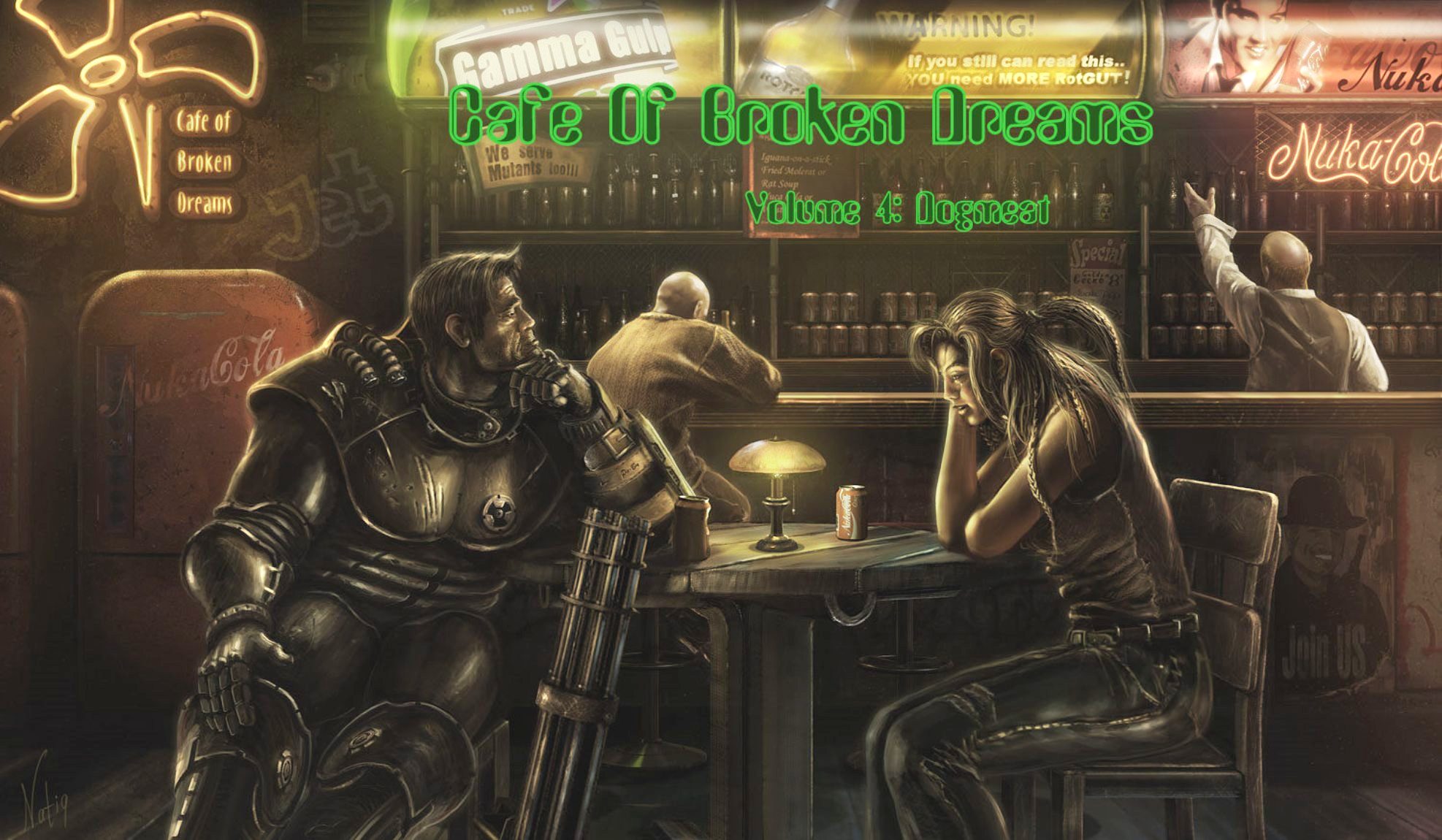
Cafe of Broken Dreams

I'm not saying we should use this exactly but the style of this image I think would make a really good backround.The rundown Building mixed with the fluorescent lighting is something Fallout does alot.--Gdubs (talk) 02:34, November 19, 2012 (UTC)
- It seems a very busy image, but I like the Nuka Cola sign. Agent c (talk) 02:43, November 19, 2012 (UTC)
I love the image concept but it must be noted most of what is in the middle would be covered by the text area.
That said I LOVE the image. If any one could find a way to make it work I would be all for it. I love all the Nuka Cola signs and the over all atmosphere.
![]() SaintPain→ That was broke afore I got here."
SaintPain→ That was broke afore I got here."
I'm not precisely sure where this image originated though I imagine it wouldn't be too difficult to find out.
I like it because it's the right mix of a depressed yet alive and charming atmosphere, not going to far into the overly goofy or gloomy territories.
Maybe the image could be edited or simply split? --Gdubs (talk) 09:36, November 21, 2012 (UTC)
Discussion moved
Discussion of any changes to the site's theme have been moved to the official background image submission thread at Forum:Nukapedia_site_theme_-_Background_image. Please see details there on how to submit an image for consideration.