Okay Art-Lovers, Welcome to the official logo change page.
I'm planning to work this as follows, but as this is a wiki, I'm happy to take suggestions or be overruled at any point. The goal is to be a bit more organised than the last time.
Process
1: First up, we have the "Consulting and Entry" phase. I'm planning to keep this open for 2 weeks. During this time you can create your masterpieces, post them here, and if there's a few Q's from others, you can respond with a few answers.
2: Then comes the first round. If there are too few entries (less than 3) in a category the first round gets skipped. The first round will work like the first phase of the name change poll, with the main difference being that no new entries will be accepted. You will be allowed to vote "Yes" on as many entries as you like, with the top contestants moving to phase two. If there are between 3 and 5, this will be the top 2, and if more than 5 the top 3. This is open for a week or so.
3: The final round will work like the second part of the name change poll, in that you will have a single vote in each category. The previous finalists (or all entries if there are only 1 or 2) will be pitted up against "No Change" - i.e., whatever logo is in that current category.
Categories
Given that we've changed the name and are the main logo I think its only fair that we put any logo being used for wiki purposes up as "Fair Game" - as The Vault will probably want to continue using our incumbent logos I think this is the best possible time to put them on the table. Please state which logo you're looking to replace: main logo, news, a template, polls, etc. If you don't I'll have a guess at your intentions.
Favicons
Just when creating entries for the main Nukapedia Logo category, please bear in mind that a Favicon will be needed to match... this is probably going to need something with some resemblance to the main logo - at least same colours. I think we night need to look at running partners... Although a little mix and match might also work - I can see Nukapedia Rust Red working well with the top-toward-me bottlecap. Agent c 20:22, January 8, 2012 (UTC)
How to enter
Create a 2nd level heading for your entry (thats the one with two ='s each side) Link to the picture (either direct or upload and post direct). Tell us about your picture, and which logo you see it replacing. Don't forget to sign your entry.
I'd ask those who have submitted logos in previous pages to do so again here, just so you can have your comments. If I don't see an entry from those I'm aware of in a few days, I'll try to get your entry up.
Voting - please read this BEFORE voting opens to ensure your vote counts
Voting is not yet open, but if you intend to vote, please make sure you are a registered Wikia/Nukapedia editor and have made at least an edit somewhere on this wiki before the polls open. This will help us to determine that your vote is a legitimate one. I intend to open voting on 20 Jan, unless otherwise suggested/over-rulled... Agent c 00:30, January 6, 2012 (UTC)
Process Comments Section
- Yessie, Mr YouTube, if you don't like the temporary titles I've used to describe your entry, you're welcome to change them. Agent c 14:37, January 6, 2012 (UTC)
Nukapedia "Bottle Logo" Entry
here is my logo. Just credit it to Yes-Man if you use it. I honestly don't think it's that good, but Scar thought I should submit it.
(Entry in new NukaPedia Logo category)
![]()
Nukepedia "California Bear Flag" Entry
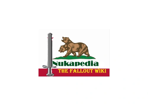 Here is my entry: http://cutlock.blogspot.com/2012/01/new-logo-for-nukapedia.html not a very large image right now, I'll make it larger though. Now, why should this one be chosen? That is a good, good question, the answer is simple, very simple indeed. Unlike other ones which show good design, they don't stay true to Fallout. Its the same thing, why have a show called Buffy the Vampire Slayer when you show Nikita instead. Why have a coca cola bottle as the logo, no offense, when you could have something that actually shows what Fallout is about. The one at the below the red one with bullet holes, while great artistic work, I do not believe shows what this wiki is about at first glance, does not show that it is fallout.
Though, keep this in mind, why have one logo when you can multiple ones. Why just use my one, when for alternating months, you can use other ones. Why use my one or the other ones for the favicon, when you can use something else entirely. Also the wiki's background should be changed, as all designs are leading for a more RED approach.
Vote for the Knights, vote for Youtube.
Cut the locks, but do not be cut down.
--Mr. Youtube 03:34, January 6, 2012 (UTC) (Entry in new NukaPedia Logo category)
In my personal opinion, this is extremely shoddy work. No promises that the NCR will be a recurring element either, so we should stick with a logo that the can referenced to every Fallout game up to date. Skål! 19:35, January 8, 2012 (UTC)
- Without adding any comments on the quality of this editor's work, I also feel that the logo should be directly related to something Nuka-colaish. That's the name we chose, like it or not, so that's the motif we need to go with. In for a penny, in for a pound.The Gunny 19:43, January 8, 2012 (UTC)
- I Disagree here, I think we can have a "Nuka" logo that isn't NukaCola related - We could just have something related to Nukes, or something generic that doesnt invoke any particular in game symbolism. Agent c 20:16, January 8, 2012 (UTC)
- Tuche. Point taken. I will rephrase: I don't feel something as specific as an NCR logo or CL logo is as germane as something Nuka-cola or Nukeythatgoesboom would be.--The Gunny 20:30, January 8, 2012 (UTC)
- I Disagree here, I think we can have a "Nuka" logo that isn't NukaCola related - We could just have something related to Nukes, or something generic that doesnt invoke any particular in game symbolism. Agent c 20:16, January 8, 2012 (UTC)
Nukapedia "Arizona Bull Flag" Entry
The more the merrier. I mean, if we're looking for a logo, look for all possible options. And who better to make all possible options but I?
http://cutlock.blogspot.com/2012/01/second-nukapedia-logo-entrant.html
Also, with this we can, lets say, repaint the background red? --Mr. Youtube 03:46, January 8, 2012 (UTC)
Simple Fallout Entrant
Also made by yours truly, that's three now isn't it? Well, the more choices the better. This one is simple, plaid for you folk!
http://cutlock.blogspot.com/2012/01/second-nukapedia-logo-entrant.html
Same link as the last one. --Mr. Youtube 04:05, January 8, 2012 (UTC)
Nukapedia "Bottle cap" logo
I didn't even realize there was a competition here until I got a message on my talk page. Just a quick mock-up. ▫ JohnnyMrNinjatalk 14:46, January 6, 2012 (UTC)
- The other important thing to think about when creating a new logo is how easily recognizable it would be as a 16x16 favicon. The vault door was a good one in that respect. 14:47, January 6, 2012 (UTC)
(Nukapedia Logo Category)
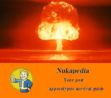
Mushroom cloud
Not much of a logo, will probably be updating this soon but i came out with this. Not finished it fully but the final design should (if uploaded) look something like this. Not sure about the vault boy image though as it may be a copyright infringement. This would be to replace the news logo Also a new idea was to replace the vault boy image later on with the new updated vault logo. Of course that will need to wait for the release of a new site logo
- Just a heads up, you may want to check out the spelling of your logo:P--
 06:10, January 7, 2012 (UTC)
Thanks for the heads up will update soon --I don't wanna set the world on fire 15:27, January 7, 2012 (UTC)
Wiki News Digest Logo - Vault Boy at GNN


This entry isn't for the main Nukapedia logo entry - its my proposed change for the wiki news digest logo. Whilst the Vault boy at the terminal is a great image, I imagine the vault will want to keep using it. Its based on the Smooth Talker logo, and the NBC radio network logos. (News Category) Agent c 21:25, January 6, 2012 (UTC)
Rusty Red Metal - Nukapedia Logo (Main)
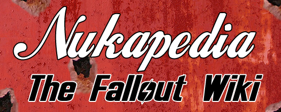
I threw this idea out before and if enough people like it (or have suggestions) I'd be happy to amend it (letters bigger/smaller/different font, more/less/different placement for rust blowouts, etc.). Although I really like the bottle and bottle cap ideas above. In my mind those could be favicons, and something more 'blown-out fallouty looking' like mine would be the main logo - but obviously I'm biased :).
On a side note: I think no matter which logo wins, even if it's just 'Nuke'-based (mushroom cloud, etc.), that we should think about altering the GREEN motif on this wiki. I assume it's alterable, as different wikis have different motifs to match the theme of the content. In this case, I think we should go RED. The rusty green metal repeating-background I think should be RED-hued. The buttons and header and footer divs should also be RED gradients. Or, at the very least, we should see what it looks like. In my opinion, it will not only better match the new logo, but will also better match the newest game in the series, New Vegas. As we all know, New Vegas has a strong red/amber motif in its logo and menu design. Thanks for reading! ---Person of Refinement 21:02, January 6, 2012 (UTC)
- YES! If yours does win, we will have to amend, though I feel you as my main competitor. Great work coming from another participant. Cheers - Youtube. --Mr. Youtube 06:07, January 7, 2012 (UTC)
- That is a very nicelooking logo, and I completely agree on the future colorpalette issue, even though I'm a bit sad losing this wonderful green/gray tone. But a red/gray (doesn't have to be red/amber in my eyes) would still be very fitting for a Fallout wiki and fit well with your logo design. If it really has to be changed more than a red/sandgrainy background might just do the trick. --BusinessMonkey 11:16, January 7, 2012 (EST)
- I really like it, and think this is one to beat... But some sort of companion Favicon would be needed (perhaps one of the bottlecaps) Agent c 20:35, January 8, 2012 (UTC)
- Looking at this again, I still like it very much, but the colours look a bit too weak. (I know the Wasteland would clearly do that to all sorts of logos, but some 'lively' colours can look more appealing, than something more realistic.) Seeing the below entry, I'm very anxious about the final entries to somehow needing to share the same colour palette and intensity. Can't have one logo with a weak red and another with a much more fuller red on another part of the site, so maybe when we finally decide, we should 'conform' our final logos more. BusinessMonkey 22:12, January 8, 2012 (UTC)
--![]()
![]() 01:04, January 9, 2012 (UTC)
01:04, January 9, 2012 (UTC)
Doc Incognito's NukaPedia Bottlecap Logo
I hope this works, I'm a bit new to Wiki usage; I've been more of a viewer up to this point.
Hey, it worked! Sweet deal. Well, here's my little bottlecap, with plenty of rust for good measure. @Mr. YouTube: I like the idea about changing the motif as well, and whatever happens with this competition, I would love to help with the design and implementation of a new theme, if you guys will have me.
Oh, and this would be intended to replace the wiki's primary logo. Tell me what you guys think!
Thanks, Doc Incognito 18:54, January 8, 2012 (UTC)
PS: I almost forgot, this is the thumbnail version. If anyone needs it, I have a full 1000*1000 version.
- Very nice. If in the end this isn't chosen by the community as the main logo, I think it would at least make a perfect favicon. It's a little close to The Vault's cog-door, but there isn't a lot you can do with such a small icon anyways.The Gunny 19:05, January 8, 2012 (UTC)
- This is quite nice, I like the ribbon effect in the middle, and it can even be seen as a homage to this place's origins. I'm wondering perhaps if we need a seperate Favicon category, as I think this would work well with the Nukapedia Rust-sign. Maybe we need to add to the next, or final stage for main icon entries a running partner for favicon? Agent c 20:20, January 8, 2012 (UTC)
- Hey guys, thanks for the comments. Do you think I should start putting together a favicon to accompany this? Doc Incognito 21:32, January 8, 2012 (UTC)
- I certainly don't think it would hurt.The Gunny 20:37, January 8, 2012 (UTC)
- Beat me to it Gunny. Agent c 20:46, January 8, 2012 (UTC)
- I like this (and the hidden omage to The Vault) very much. I'm just a bit worried how this can be implemented in a broader rectangular version (like the above main logo entry) where you can read the rather important (at least in my opinion) subtitle of Fallout Wiki with the Fallout logo'n'all. Otherwise a wonderful entry. It's more simplistic than the above entry, so I'm pretty undecided between the two. Maybe some more rust or shadows would do the trick (make it look more metallic), even though I fear it very easily could ruin the great 'immediacy' of the logo. Nonetheless I'm overwhelmed by the quality of some of these entries. BusinessMonkey 22:04, January 8, 2012 (UTC)
- Hey guys, thanks for the comments. Do you think I should start putting together a favicon to accompany this? Doc Incognito 21:32, January 8, 2012 (UTC)
- This is quite nice, I like the ribbon effect in the middle, and it can even be seen as a homage to this place's origins. I'm wondering perhaps if we need a seperate Favicon category, as I think this would work well with the Nukapedia Rust-sign. Maybe we need to add to the next, or final stage for main icon entries a running partner for favicon? Agent c 20:20, January 8, 2012 (UTC)
Hello all, here are some favicons, in 16 x 16 pixels or less, or your money back.

Here we have the bottlecap and squiggle...

And here we have the bottlecap and "N" for NukaPedia.
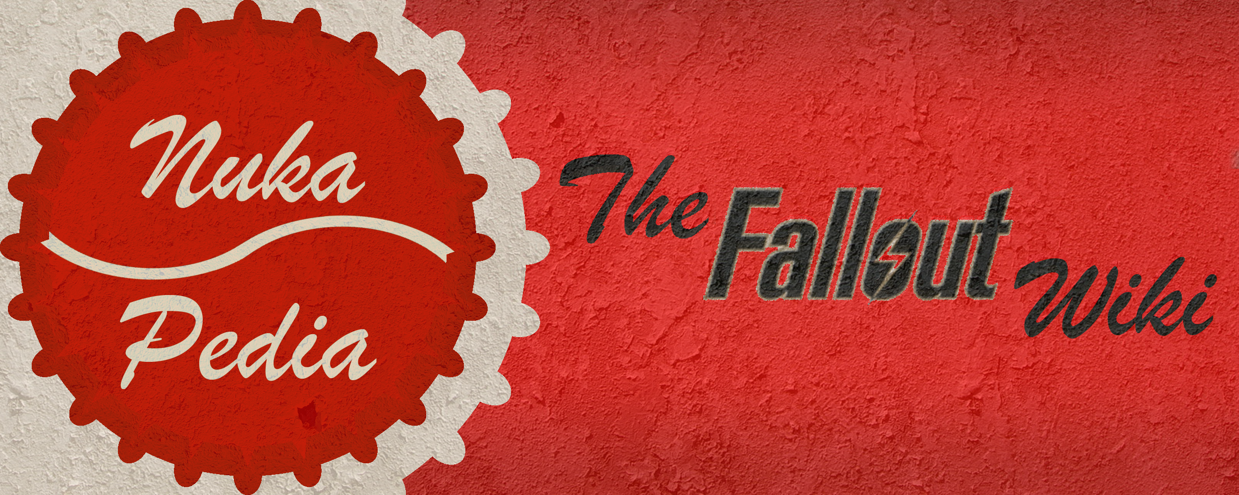
@BusinessMonkey: That's a good point, the addition of "The Fallout Wiki" could be pretty important. I have a way of incorporating it that just might work, so I'll report back here with a draft. Doc Incognito 23:08, January 8, 2012 (UTC)
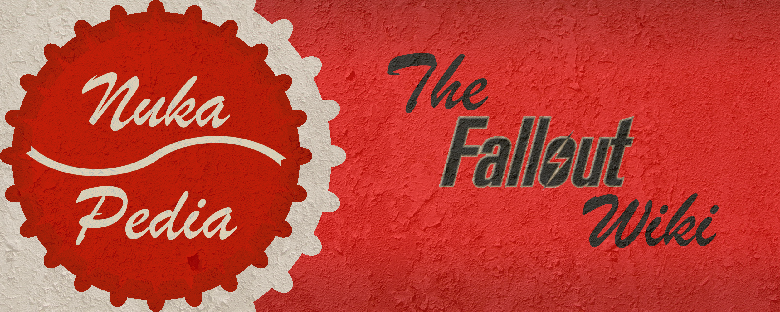
Well, I'm back with a banner image, but it didn't turn out as well as I imagined.

I tried to use gradients to make the new portion have the illusion of curvature, sort of like an old soda machine, but as you can see, that didn't work out. Anyone have some suggestions?
Thanks, Doc Incognito 23:30, January 8, 2012 (UTC)
- Well, if it were up to me, you'd be the winner right here. I think this is the best submission we've got yet. Good work. 114.77.77.5 23:33, January 8, 2012 (UTC)
- Damn, I think we have a new front runner. Having "the Fallout Wiki" staggered like that doesn't work for me, but the mix of fonts does, as does the colour.... Great work! Agent c 23:40, January 8, 2012 (UTC)
- Well, we could ask him to put the words one above the other, and maybe a bit larger. I do like the favicons, though, and I'm sure we could implement those starting today if the community complies. 114.77.77.5 23:42, January 8, 2012 (UTC)
- I was just editing my comment to say something like that. Just a suggestion, up to you DOc, but maybe "The" hard left, "Fallout" starting somewhere under the E, and "Wiki" starting just before where Fallout ends... Would allow each word to be a bit bigger - although I'd make Fallout a bit bigger than the others - give it the right emphasis. Agent c 23:44, January 8, 2012 (UTC)
- Thanks for all the feedback, guys! Is this better? Doc Incognito 00:05, January 9, 2012 (UTC)
- I was just editing my comment to say something like that. Just a suggestion, up to you DOc, but maybe "The" hard left, "Fallout" starting somewhere under the E, and "Wiki" starting just before where Fallout ends... Would allow each word to be a bit bigger - although I'd make Fallout a bit bigger than the others - give it the right emphasis. Agent c 23:44, January 8, 2012 (UTC)
- Well, we could ask him to put the words one above the other, and maybe a bit larger. I do like the favicons, though, and I'm sure we could implement those starting today if the community complies. 114.77.77.5 23:42, January 8, 2012 (UTC)

I personally think that there shouldn't be a vote, and that we should just use this one. But, I doubt Agent c would be happy with me for that. Anyway, both look great. I'll leave it up to Agent to decide. 114.77.77.5 00:56, January 9, 2012 (UTC)
- I love this one a lot and it definitely has my vote. I love the green scheme of our wiki though.-- 00:57, January 9, 2012 (UTC)
- Hmm.... good point there, Ryan. Either we's have to change the background and colour scheme to reflect the logo, OR we get Doc Incognito to kindly change his logo so that maybe only the bottle cap is red and the rest is green. 114.77.77.5 01:00, January 9, 2012 (UTC)
- We'd need to have a vote not to have a vote I think... *g* I think we should be fair to the others, and I've got an idea on a different track I want to see if I can make work...Agent c 00:59, January 9, 2012 (UTC)
- If we did a red and green logo, it would make me think "Christmas" too much, you know? We'll see how it works out.-- 01:04, January 9, 2012 (UTC)
- I agree, red and green does say "Christmas" to me, so I would lean towards a red color scheme. As I stated above, in the event that you guys go with a red color scheme, I would be happy to develop further images that would be needed. Doc Incognito 01:07, January 9, 2012 (UTC)
- In the event that it does change to red, let's make it a soft red. The 28 days later wiki hurts my eyes lol.-- 01:09, January 9, 2012 (UTC) http://28dayslater.wikia.com/wiki/Main_Page
- In the event that it does change to red, let's make it a soft red. The 28 days later wiki hurts my eyes lol.--
- I agree, red and green does say "Christmas" to me, so I would lean towards a red color scheme. As I stated above, in the event that you guys go with a red color scheme, I would be happy to develop further images that would be needed. Doc Incognito 01:07, January 9, 2012 (UTC)
- If we did a red and green logo, it would make me think "Christmas" too much, you know? We'll see how it works out.--
I would suggest that we... erm... test run a new wiki colour scheme. It scares me to think of how people will react to a red Fallout wiki, but if it must be done it must be done. Of course, we run it by Clyde and the admins first. 114.77.77.5 01:13, January 9, 2012 (UTC)
- Personally, I like it right now. But a red colour scheme would be...
abhorrentbeautiful, in my opinion. -ΣΔLet's talk! 01:28, January 9, 2012 (UTC)